

Fluid | Balanced | Approachable
I find delightful and unexpected solutions rooted in human connection.
Multidisciplinary Designer

Funion
Architecture | Concept Development | 3D Modelling
Objective: Through the design of a small playhouse, integrate learning outcomes that include applying key Design Elements & Principles, considerations around the human body in space, presenting and communication 3D ideas, and core software skills.

The conceptual development of the Funion came from the idea of what “play” felt like. One way idea manifested was through the idea of layers, where ones spatial relationship with others was warped and overlapped in creative ways, allowing for fun and unique interactions.
Therefore, the visual concept for the playhouse simply had to be an onion.
This proved to be a tremendous challenge in SketchUp, but one that resolved in a beautiful and unique way, where an onion skin and layers of curved slats formed a housing for seating, a hammock, and nooks that someone could hide away in with their friends.


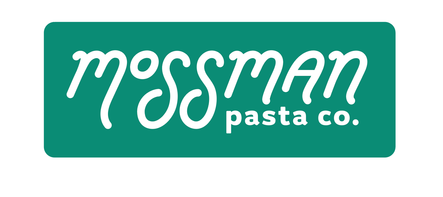
Mossman Pasta Co.
Packaging Design | Logo Design | Branding

Objective: Design a brand and packaging to introduce a new line of locally produced organic products, targeted at a young and urban audience.

Mossman Pasta Co. is a delightful exercise in branding, type design and packaging design.
The project began as a logotype design for a pasta brand, where I challenged myself by designing the type from scratch. The words I chose to guide my process were fresh, lively, and quirky. I knew the name had to feel fun and weird, so Mossman was an instant yes during a brainstorming session.
Shaping the type from scratch had always been a curiosity of mine, and doing it for an organic-style brand seemed like a great place to start.


The final logotype omitted the “moss man” to enhance clarity and cleanliness, so the packaging had to introduce it instead.
This proved to be quite the challenge — while an immediate solution would be do add some sort of “moss man” looking character, whatever that may be, I wanted to see if I could find something a bit different.
After many iterations, a moment happened where an irregular shape sparked an idea for a bunch of little moss blobs. It felt quirky and fun, and could be easily adaptable to different packages


This project was a great learning experience on what an effective concept could be. If it can be adapted to different applications with ease, and to great delight, then it’s worth using!

Flip Lamp
Lighting Design | Industrial Design | Fabrication
Objective: Design, Document, and Fabricate a small Luminous Object, while exploring the relationship between Narrative, Form, Materiality, and Value— from concept to fabrication.


The flip lamp was a project designed with functionality as the main guiding principle. After seeing the Tikal Lamp by Pier Giuseppe Ramella in a local vintage furniture store, I had internalized the idea of a lamp that physically turns around to mechanically change its brightness “setting” instead of using an electric dimmer. Since that lamp is very much out of my budget, the Luminous Object project was the perfect opportunity to create something similar.


These sketches and digital iterations are from a point in the process where it felt a bit too complicated. I tried ideas that closely resembled my reference lamp, because I didn’t know any other way a lamp like this could work. A lot of this early design work was about figuring out the mechanisms that would allow the top part of the light to turn around, thereby reducing the intensity of light.
Through some very productive feedback sessions, I learned that the mechanism for a dual-shade lamp didn’t have to be so complicated. The mechanism could just be a simple reflection. Once I learned this, it completely opened up the process, and it became easier to generate interesting ideas.
The moment I arrived at the rectangular inner-piece, inside another piece with angled walls, it felt like the right solution. It was functionally simple, and created elegant contrast and rhythm between the angles and shapes.

I was nervous about how the final piece would function, but to my delight, it worked exactly, exactly, how it was intended to.
The light shined nicely through the shoji screen, while the reversed version created beautiful gradients of light across the outside of the inner-piece.


Let Them Eat Cake
Graphic Design | Photoshop | Typography

Objective: Design a cookbook, ensuring its recipes, graphics, and the other ancillary information, work together as part of a coherent concept, that brings the story, the foods, and the dishes to life, while considering the hierarchy of the typography, professional typesetting of the main text, the connection between text and images, and the continuity of all pages.

The collaborative brainstorming process found its way to “punk zine meets french revolution”, which took all of us by surprise and was incredibly exciting. We researched how punk artists made their work feel energetic, unrestrained and rough while juxtaposing it with delicate desserts, ornaments and royalty. Using heavily edited images, and breaking all the rules of a traditional cookbook layout, we arrived at something that felt unruly, humorous, yet fleshed out with care.


“Laneway” Listening-Room
Architecture | Model Building | Interior Rendering
Objective: Design laneway houses that reimagine the potential of Vancouver’s urban fabric by integrating nonresidential programs to create dynamic, mixed-use corridors. Explore how these often-overlooked spaces can evolve into vibrant community hubs, balancing residential living with broader neighbourhood engagement.


The commercial programming of the Laneway Listneing Room is a Japanese-style “listening room”, where people gather to relax, and to listen to music on a lovely soundsystem, played by a DJ. Accompanying this, is a separate dance floor that transforms this program into a dynamic nightlife space.
This specific outcome of the Laneway project uses the term loosely, since a space playing loud music being placed in the middle of a neighbourhood block is purely a product of one’s wildest dreams, and will most likely stay there.
As a conceptual exercise however, it was a wildly exciting and challenging project. It was necessary to isolate the residential rooms as far as possible from the dance floor, and the dance floor itself had to be isolated from the neighbourhood with thick walls and a buffer room. More experimentation was thrown in the mix, with split level programming that became challenging to balance, but satisfying to see come together.
This massive and complex programming ultimately created a floor plan which far exceeded the legal limits of a laneway house, and yet it is incredible to see what is truly possible to create within the boundaries of someone’s backyard.


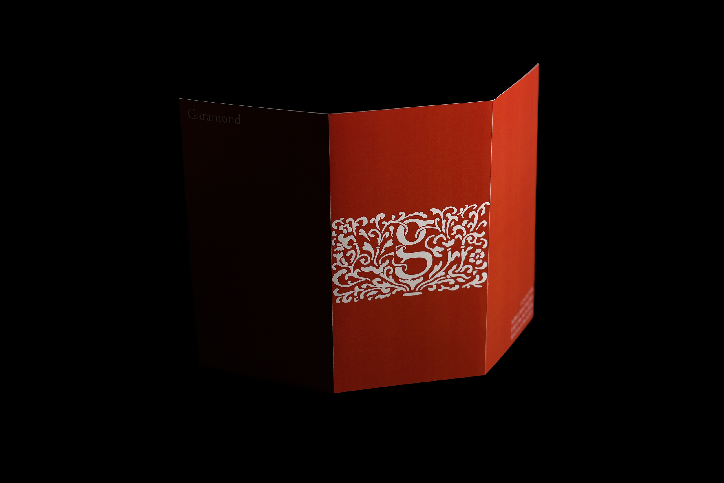

Garamond Brochure
Graphic Design | Layout | Poster Design
Objective: Design and layout a brochure that features one of five historically significant typefaces. One side of the brochure highlights historical content while the other side was a poster. The key is for the brochure to express the character and personality of the typeface in addition to the basic information.


the Lily Pad
Architecture | Interior Design | 3D Modelling
Objective: Design a small Architectural Public Space: a Parklet. Review, apply, and strengthen skills with 3D modelling and 2D drawing tools, both in the design development and communication processes, while exploring design principles and spatial awareness concepts.


The Lily Pad was inspired by an appreciation for seating that felt open and deep, and was guided by a semi-arbitrary decision to use frogs as the visual narrative of the project.
The program of the parklet resolved delightfully, as the diagonal wavy seating felt like a close up of lily pads on a flowing river, and the added frog and leaf elements makes the user feel as though they are the same scale as a frog, or another small rainforest creature.


