

Playful | Empowering | Attentive
A designer who readily embraces challenges and pursues each project with curiousity and enthusiasmMulti-Disciplinary Designer
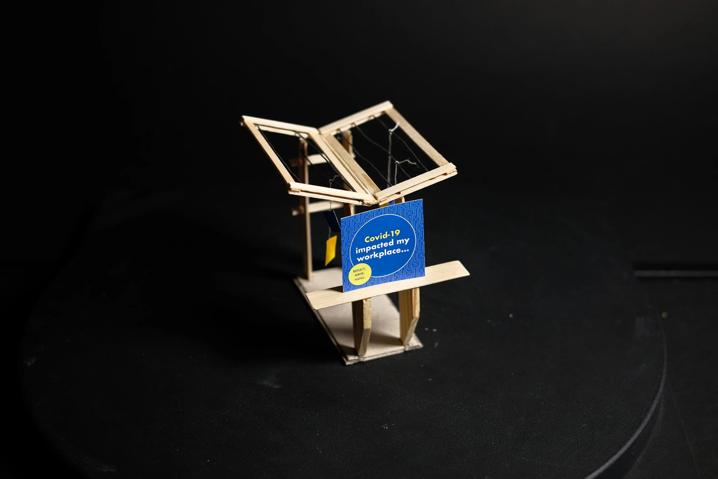
Youthful Cities
Exhibit
Objective: Develop a collaborative, design-build exhibition with Youthful Cities that explores the evolving post-pandemic workforce. Work in teams to design and fabricate four interconnected sections, ensuring a cohesive visual and spatial experience. Provide layout plans, material selections, and fabrication details.
This exhibit was a powerful exploration of the impact of COVID-19 on the workplace, specifically focusing on youth. It was a deeply collaborative effort where we were tasked with designing a space that encouraged reflection on the shared experience of the pandemic. Through the unique opportunity to merge creativity and playfulness, we crafted a design that invited participants to pause and connect. Visitors were encouraged to write a personal message or reflection on a card and hang it on strings, symbolizing both an individual moment of introspection and a collective connection with the community. This design not only captured the essence of that challenging time but also fostered a sense of unity and shared experience.


Candy Box
Objective: In a lottery choice of un-marked candy, snack or beverage, explore the sensory experience and express it in spray paint and paper cutting, while including a 3-letter word in suitable typography.
For this project, I was given a mystery bag of chips with layers of acid, spice, and crunch—each element offering a unique sensory experience. Using my observations and a few design iterations, I developed the concept of creating a modern showcase that reflected the depth of these flavors and textures. By layering paper on top of one another, I wanted to represent the complexity and dynamic nature of the chips. As I guided the design, the choice of color came intuitively, driven by the vibrant lime and spicy notes that stood out in the flavour profile.


Bebe Vio Exhibit
Objective: Design an immersive exhibit that tells the story of Bebe Vio, a Nike athlete and wheelchair fencer, while reinforcing Nike’s brand values. Incorporate spatial storytelling, interactive elements, and graphic design to engage visitors. Provide a scaled model and visual presentation illustrating key design features.
For the Nike x Bebe Vio Exhibit, I focused on Vio’s wheelchair fencing journey and the connection between her prosthetic arm and the sport. Drawing from Nike’s industrial, sporty aesthetic, I created an immersive space with a large poster of Vio framed by acrylic "shards," symbolizing her resilience. The fencing mask allowed the audience to experience her world, while a projection of the video "Winning Isn’t for Everyone" activated the space. I incorporated glowing frames to highlight the evolution of her prosthetic arm, using Nike’s green color and mesh materials to enhance the industrial feel. A zig-zag path encouraged movement and exploration, creating a dynamic exhibit that reflected Bebe’s strength and Nike's spirit.
Parklet
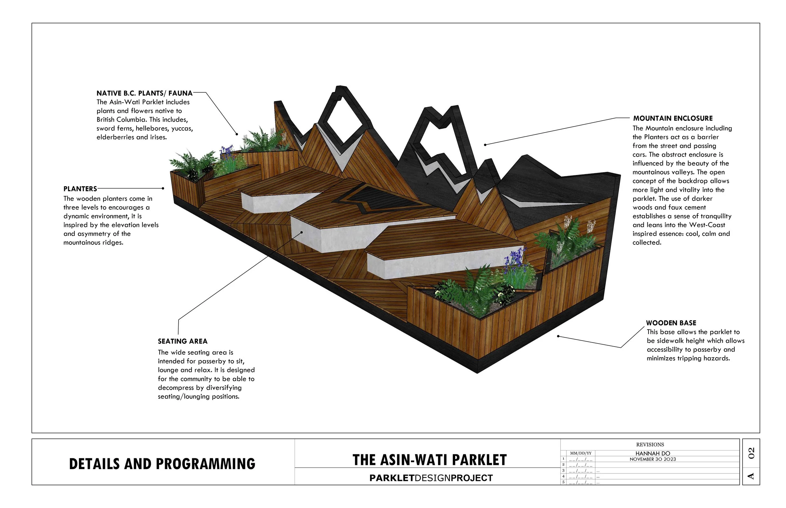
Parklet 2.0 - Maintain design intent in the face of new technology. Using SketchUp, Blender and Apple Vision Pro, create an AR experience from a first term design project of an urban Parklet.


For this project, I drew inspiration from the natural beauty of B.C., as both a local and nature enthusiast. I wanted to create a calming space that reflects the serenity of the wilderness. Inspired by the natural facade of the mountain, I used it as the backdrop and incoporated directional angles and triangular geometry to emphasize the physical qualities of the mountain, while native B.C. flowers encouraged users to slow down and appreciate nature. The seating is designed at two levels, offering options for either sitting or lying down, allowing for a deeper connection with the environment. While the use of natural materials was key in fostering a sense of calmness, further enhancing the peaceful atmosphere.
-
![]()
Parklet 1.0 - Design a small Architectural Public Space: a Parklet. Review, apply, and strengthen skills with 3D modelling and 2D drawing tools, both in the design development and communication processes, while exploring design principles and spatial awareness concepts.
-
![]()
-
![]()
-
![]()
-
![]()
-
![]()


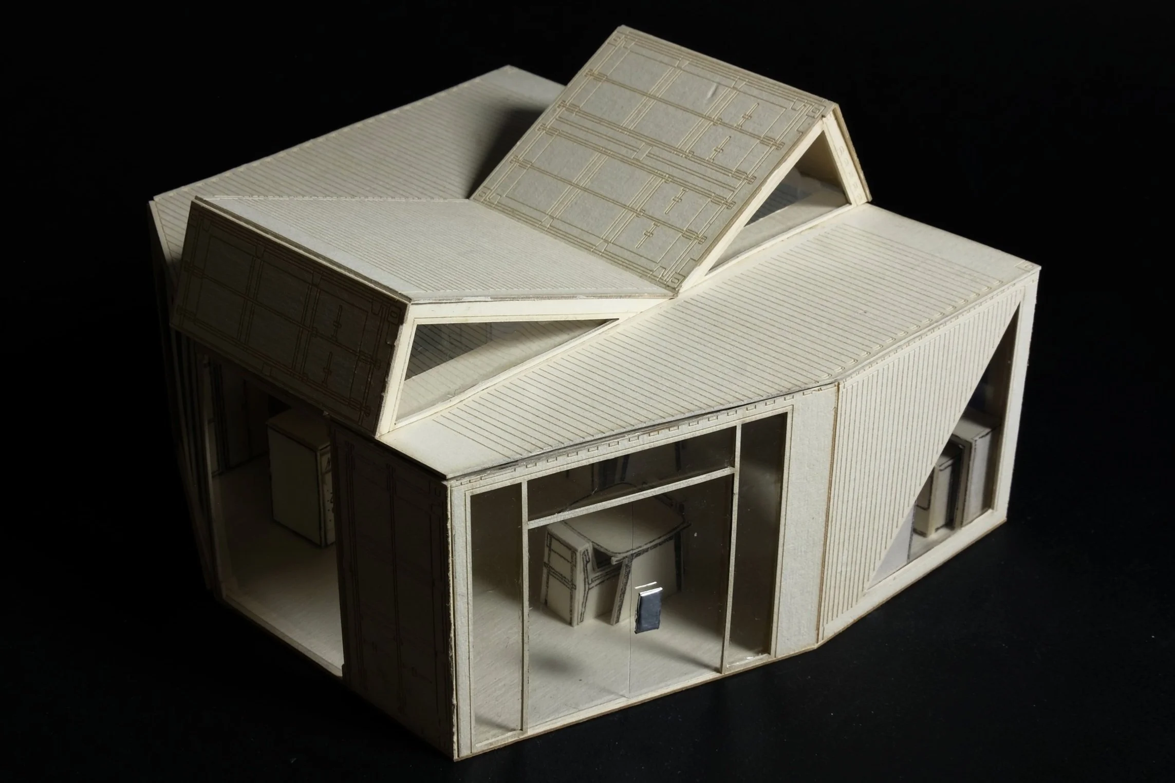
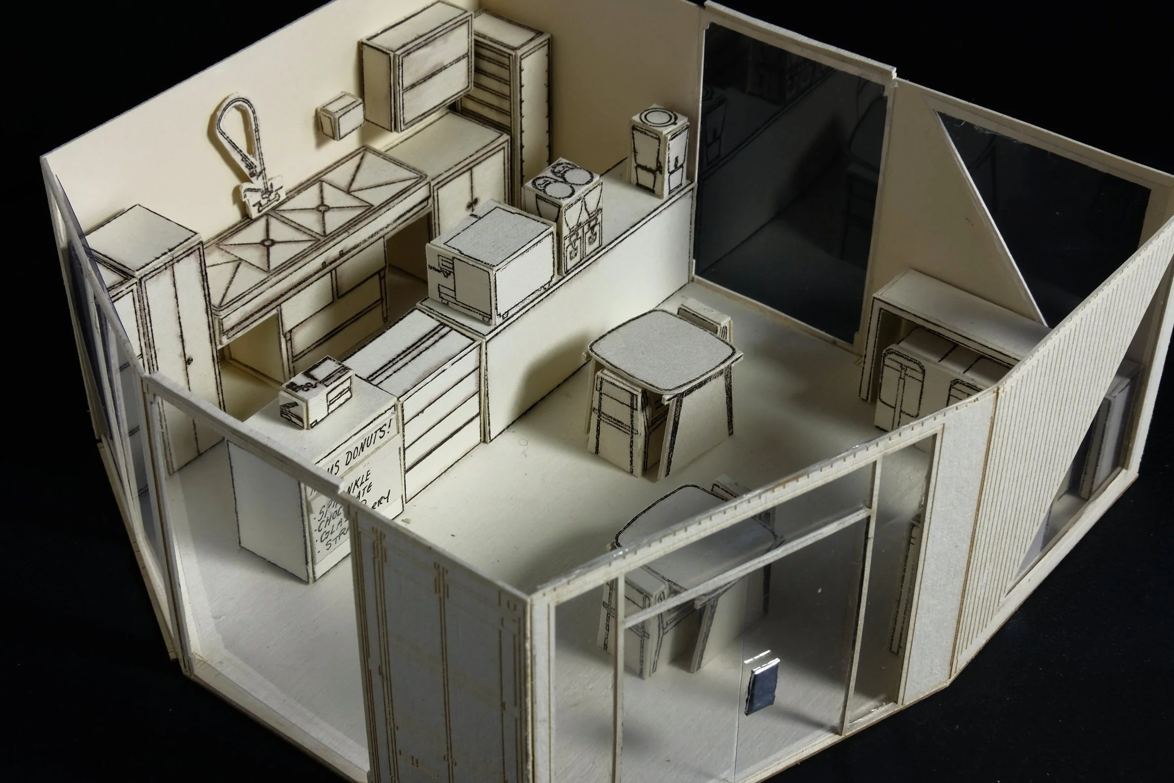
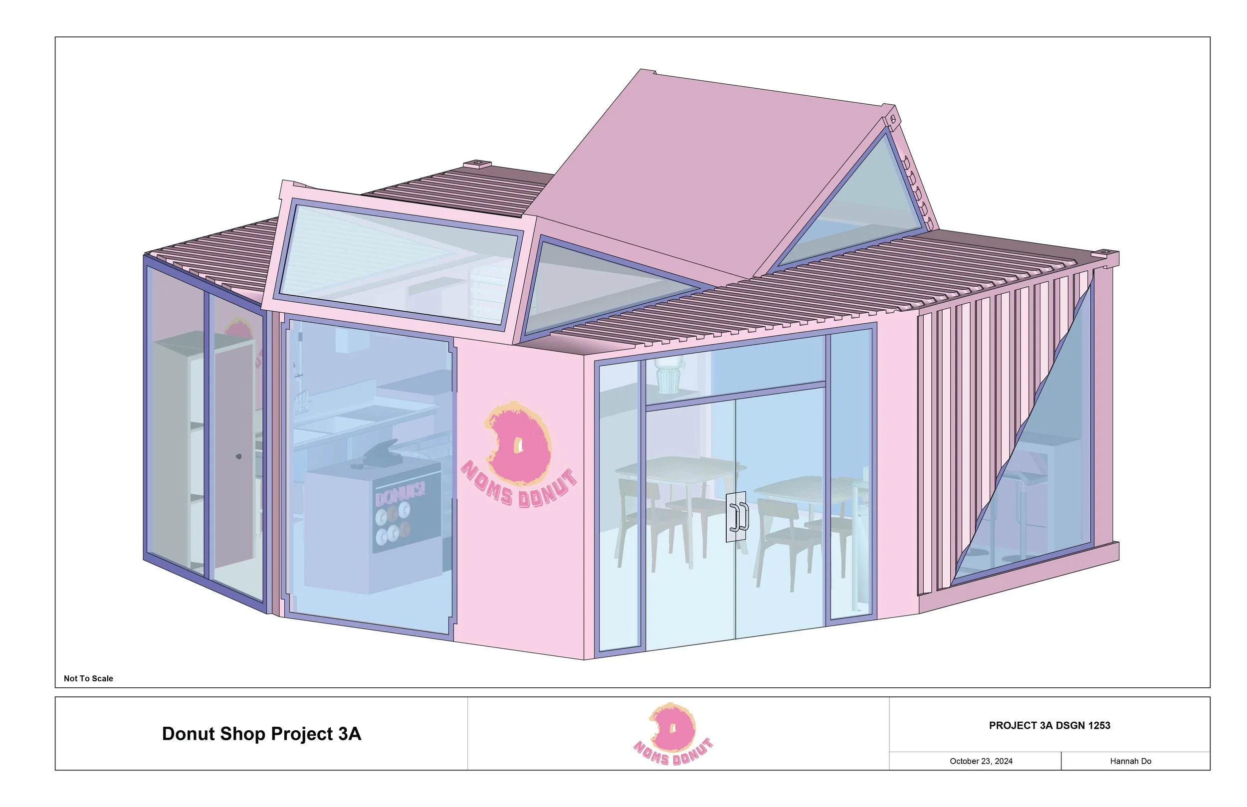
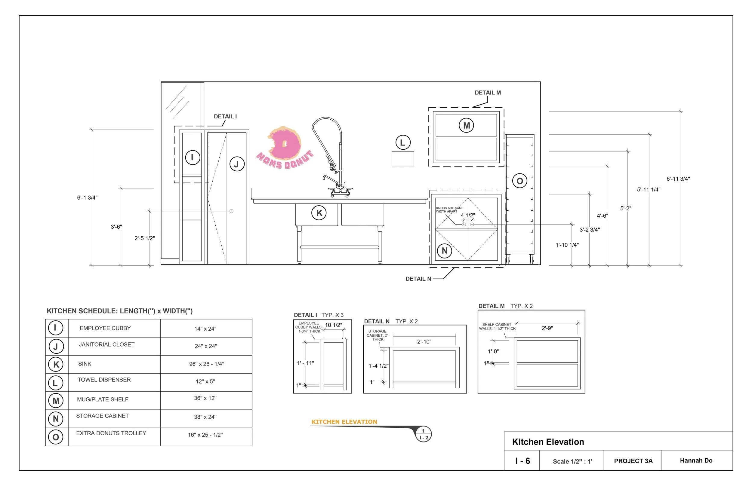
Objective: Develop the functional space for a Donut shop using the intersections of two shipping containers. Utilize CAD to create floor plans and elevations to then create a scale model.
For the donut shop, I wanted to create a design with plenty of light and space. Given the strict project parameters, it was both challenging and fun to craft a space that worked well for both users and workers. For my final design, I cut the corners of the containers to create more ceiling height and spread them apart to lengthen the space further. The added height helped reduce the cramped feel of the containers, and by focusing on windows and light, I aimed to maximize the shop's openness and comfort.
Donut Shop


Mixed Use Laneway Home

Objective: Design laneway houses that reimagine the potential of Vancouver’s urban fabric by integrating nonresidential programs to create dynamic, mixed-use corridors. Explore how these often-overlooked spaces can evolve into vibrant community hubs, balancing residential living with broader neighborhood engagement.


Interior Renders

Primary Bedroom

Mixed Use Dining Space
Inspired by Vietnamese architecture, materiality and colour, this project blends nature, functionality, and efficiency while adhering to laneway bylaw restrictions. Drawing inspiration from the cultural practice in Vietnam, where homes often blend with family businesses right in front of living spaces, this design embraces the idea of integrating commercial and residential areas. The intention of the home is to seamlessly connect the mixed use dining area and kitchen, fostering interaction and a sense of community. I wanted this sense of transparency to encourage a welcoming, authentic environment where the boundaries between public and private spaces are fluid between user and homeowner.


Playhouse
Objective: Through the design of a small playhouse, integrate learning outcomes that include applying key Design Elements & Principles, considerations around the human body in space, presenting and communication 3D ideas, and core software skills,

Pasta Packaging
Objective: Design a brand and packaging to introduce a new line of locally produced organic products, targeted at a young and urban audience.


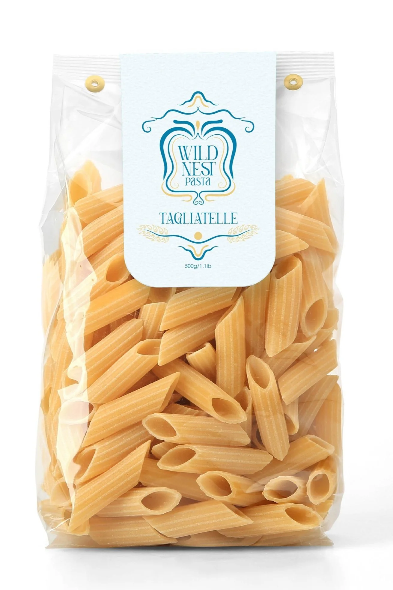
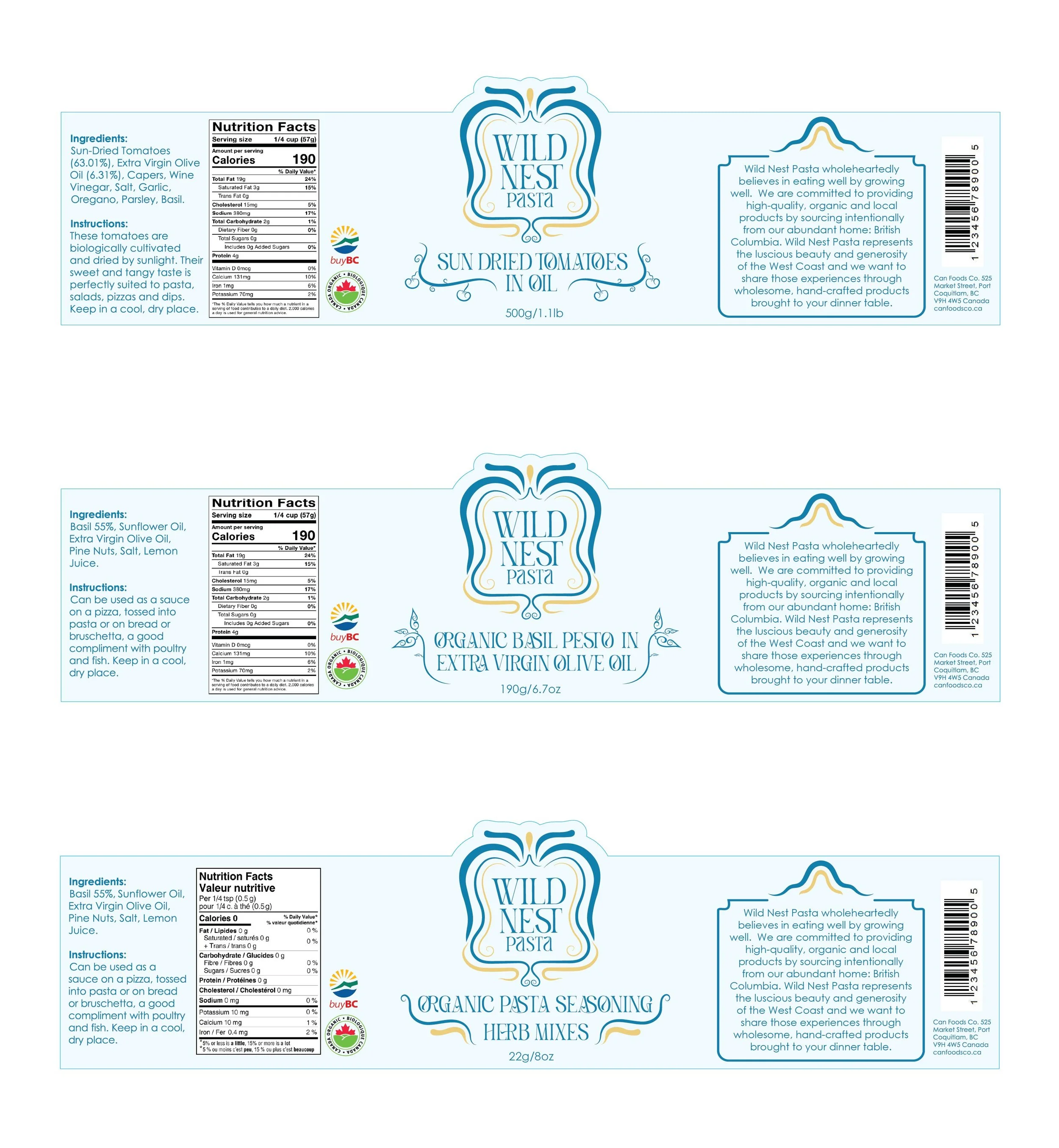
For this pasta packaging, I wanted to blend West Coast vibes with Art Nouveau elements to create a brand that’s both elegant and wild. I used organic, flowing shapes to frame the brand name, giving it a natural, balanced look. The provincial bird, the Stellar Jay serving as the brand mascot, bringing a sense of local charm and connection to nature, while tying the design together with a bright and natural colour combination.

Event Poster
Objective: Create a poster for a live event using both Illustrator and Photoshop. Include a main title and event details (time, location, url, etc). Integrate pixel and vector elements to produce a visually engaging design.
For this project, I wanted to create a poster for my dad’s old restaurant, using one of my favorite photos of him in the place. It ended up being the most natural and sentimental design I’ve made so far. I was inspired by the determination and hard work my dad was able to foster in this community and wanted to pay tribute to that with a grand opening-style poster. The goal was to capture that grassroots, playful and nostalgic essence by adding texture and noise to give it a bit of an old-school feel. It was a deeply personal project, and a sweet way to pay homage through this design excercise.