Adaptable | Perseverant | Intentional
I approach every project with passion — creating impactful designs that cater to unique solutions in various styles. I combine creativity with precision to bring your vision to life.

Communications Designer
Personal Branding
Communication Design | Branding
Objective: Define the core concepts and messages needed to communicate the type of design career you want after you finish the program. Then, through a close look into your objectives, create the visuals needed for your professional brand.
Process: I didn’t want to miss the opportunity of the shape of a “K” and a “R” being quite similar in many typefaces so after playing around with their similarities, I found a sturdy shape that represents intentionality while being adaptable. The mouse came to be the imagery for my personal branding as it represents my eye and passion for graphic design as well as the triangle shape working with the lines and angles of the “K” and “R".”


Create a unique approach to a presentation (pocket) folder. It must be able to hold an 8½" x 11" vertical piece of paper and have a slot for a 2" x 3½" (vertical or horizontal) business card. Design with your brand in mind. Provide dielines, fold lines, and an area(s) with spot varnish.

Steller
Communication Design | Branding
Objective: Design a brand and packaging to introduce a new line of locally produced organic products, targeted at a young and urban audience.
Process: With this prompt, I wanted to create a pasta brand with the goal to create a high quality brand that people in BC can not only trust but also afford to bring on their BC adventures. Hiking, camping and lake days no longer need to be paired with cheap boxed pasta.
Steller is symbolized by the British Columbia bird the Steller’s Jay. Steller’s packaging pictures beautiful landscapes found in this province that are absolutely stellar!


Event Poster
Communication Design | Graphics
Objective: Create a poster for a live event using both Illustrator and Photoshop. Include a main title and event details (time, location, url,…). Integrate pixel and vector elements to produce a visually engaging design
Process: The theoretical event is a Jazz event targeting the younger generation. Jazz may be considered for the older generation so this poster needs to appeal the younger audience by representing itself as more “grunge” and a “underground event.” With pricing and locations listed in an easy to read format, this poster is engaging for users walking by on their daily commute.


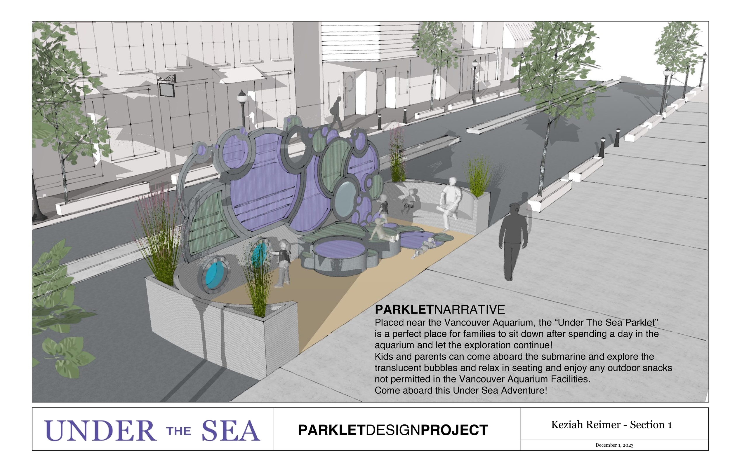
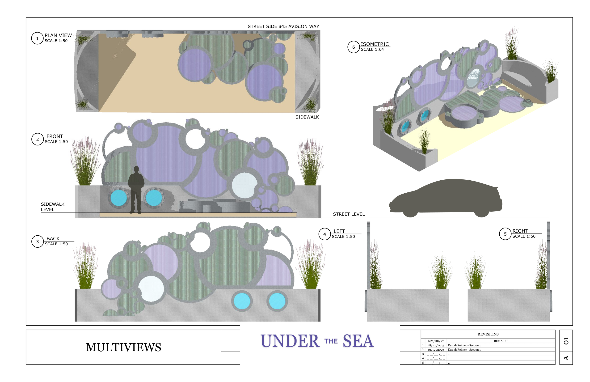
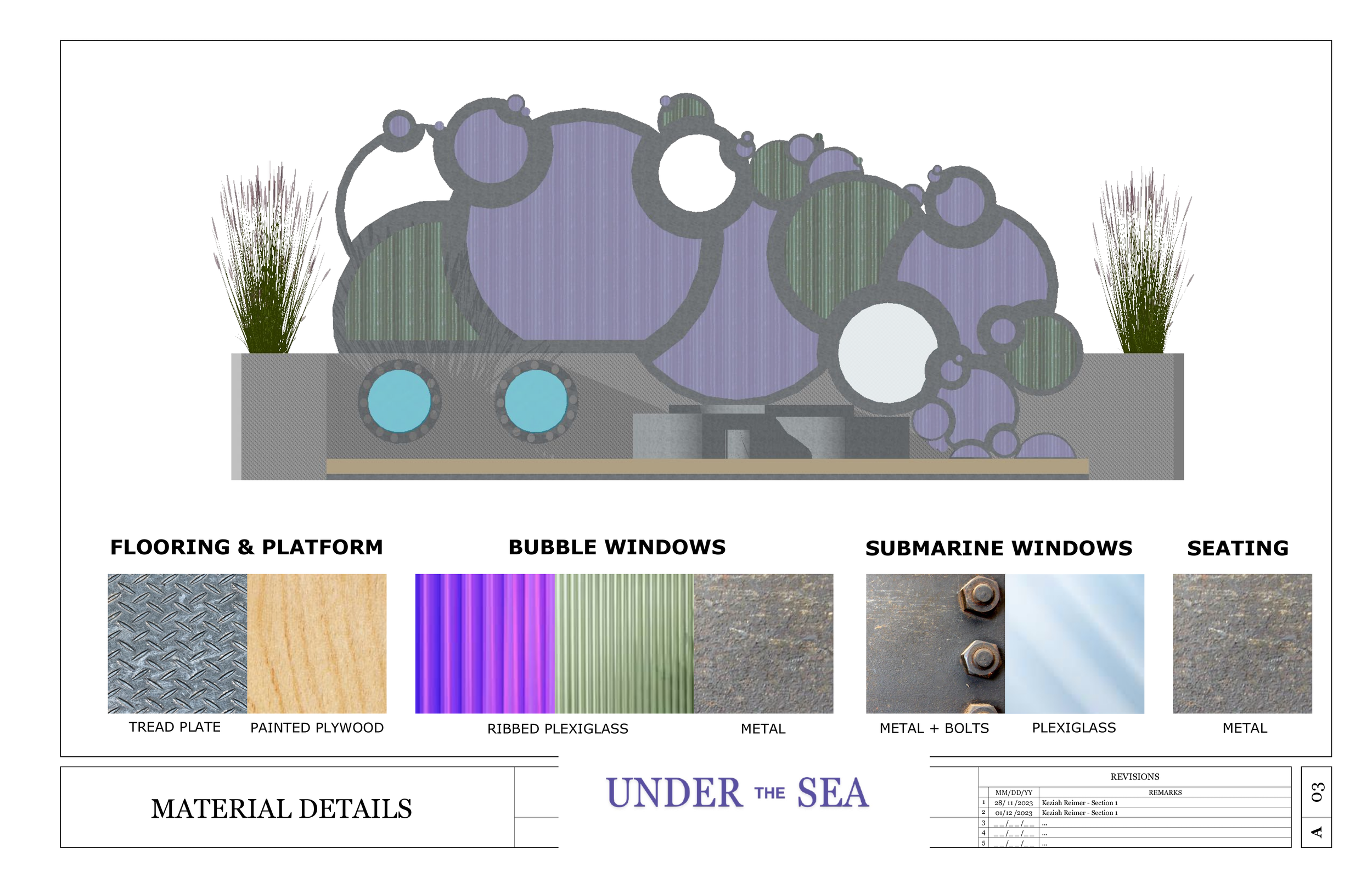
Objective: Design a small Architectural Public Space: a Parklet. Review, apply, and strengthen skills with 3D modelling and 2D drawing tools, both in the design development and communication processes, while exploring design principles and spatial awareness concepts.
Objective: Maintain design intent in the face of new technology. Using SketchUp, Blender and Apple Vision Pro, create an AR experience from a first term design project of an urban Parklet.
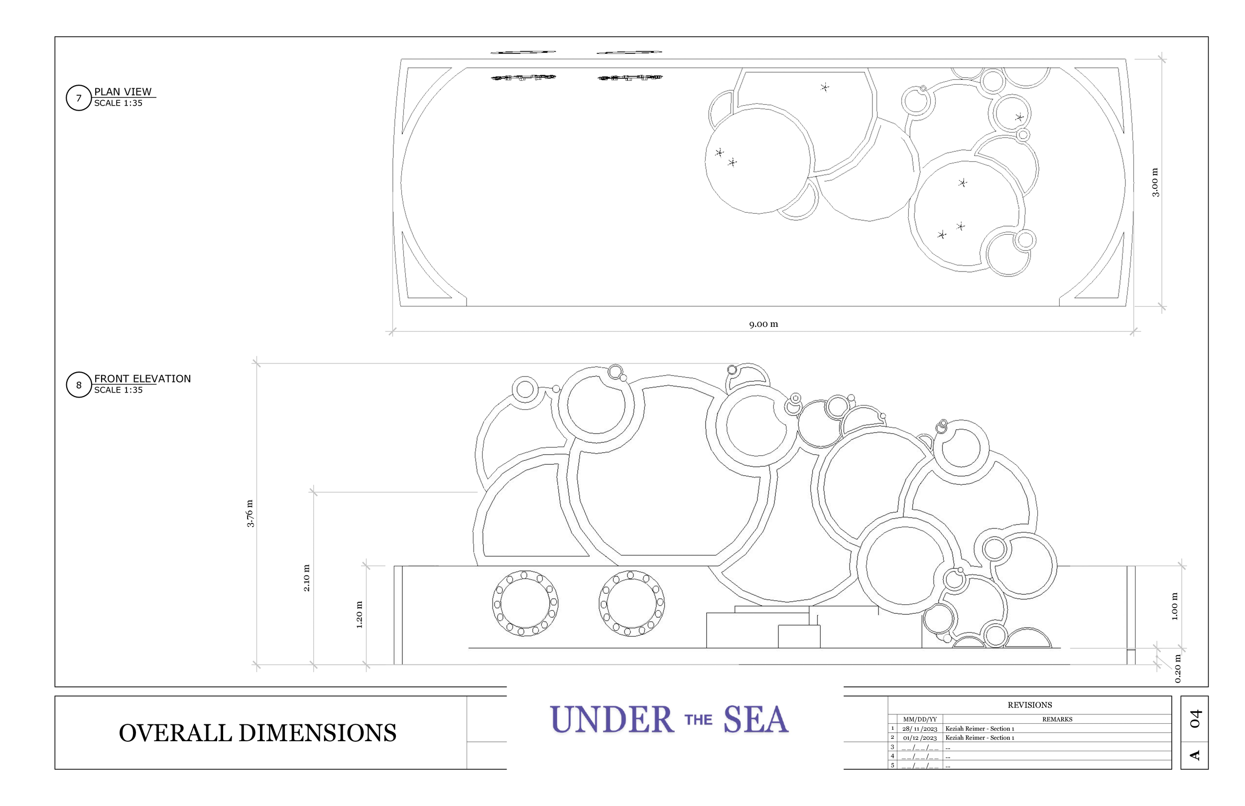
Parklet
Experiential Design

Process: Wanting my narrative to be a strong storyline with an under the sea theme all aspects were picked to incorporate that theme. Colours were shades of blue, purple and green. Shapes represent bubbles and a submarine ready for adventure. Typography is flowing and exciting for users to learn more.


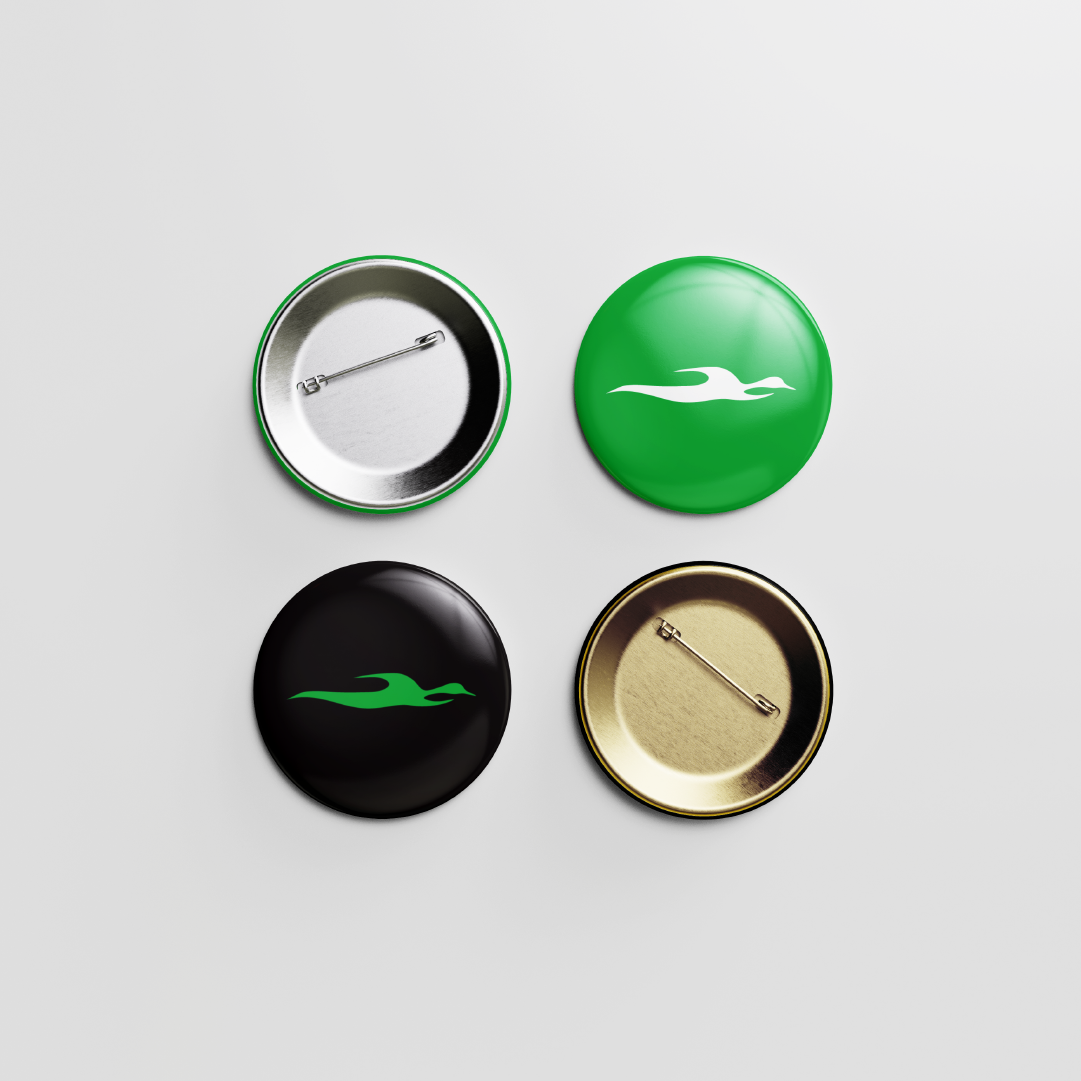
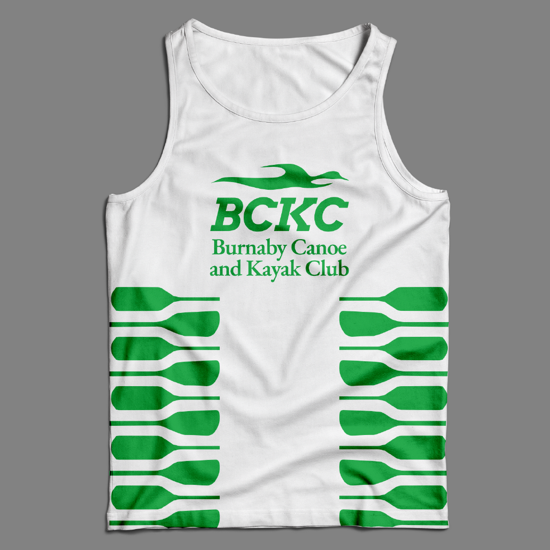
Independent Brand Project
Communication Design | Branding
Objective: Design a brand identity, graphic standards and applications by completing a self-initiated design project to meet professional development goals.
Process: I challenged myself to work with a real client who wanted a change in branding for their Canoe and Kayak club. Having a real client came with interviews and communication where I learnt the zen and strong aspect of the Kayak and Canoe sport. Using a blue heron as the symbol to represent the creatures seen in Burnaby Lake, I was able to create branding and applications that work with the heart of the Burnaby Canoe and Kayak Club.


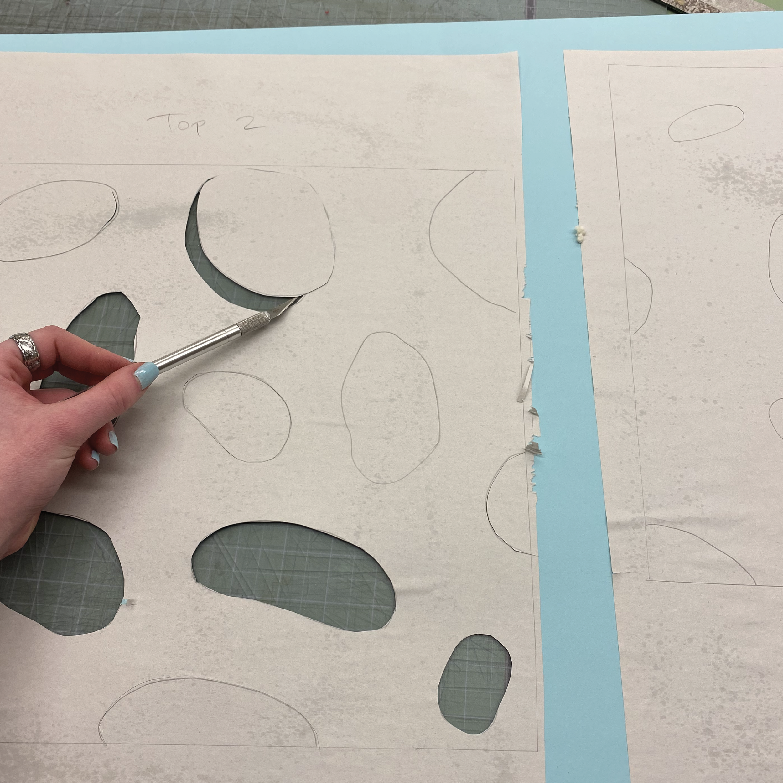
Frame of Reference
Experiential Design | Fabrication
Objective: Inspired by a lottery choice of random magazine images, create a composition using a wide variety of techniques, methods and materials. The emphasis is on reflecting the images’ experiential context through 3D visual storytelling.
Process: After receiving my image the cliff’s texture and the thin white line adding a dynamic aspect to the photo stood out to me. Taking those two things I explored how to paint that rock texture by using a spray bottle with water and rags and I used acrylic extend the white line through my build.


Magazine Spread
Experiential Design
Design a 4-page magazine considering how text and design conveys meaning; employing text hierarchies as a way to navigate; selecting appropriate typeface pairings; creating effective image and text combinations; and creating visual continuity from page to page.
Process: Choosing a topic like Pink Panther was fun to explore how to tie in playfulness within a magazine spread. I had to recolour a lot of images in Adobe Photoshop to stay consistent across the spread. Making the Pink Panther sneak across the pages without disrupting the text was a fun way to add an element of fun in this magazine!


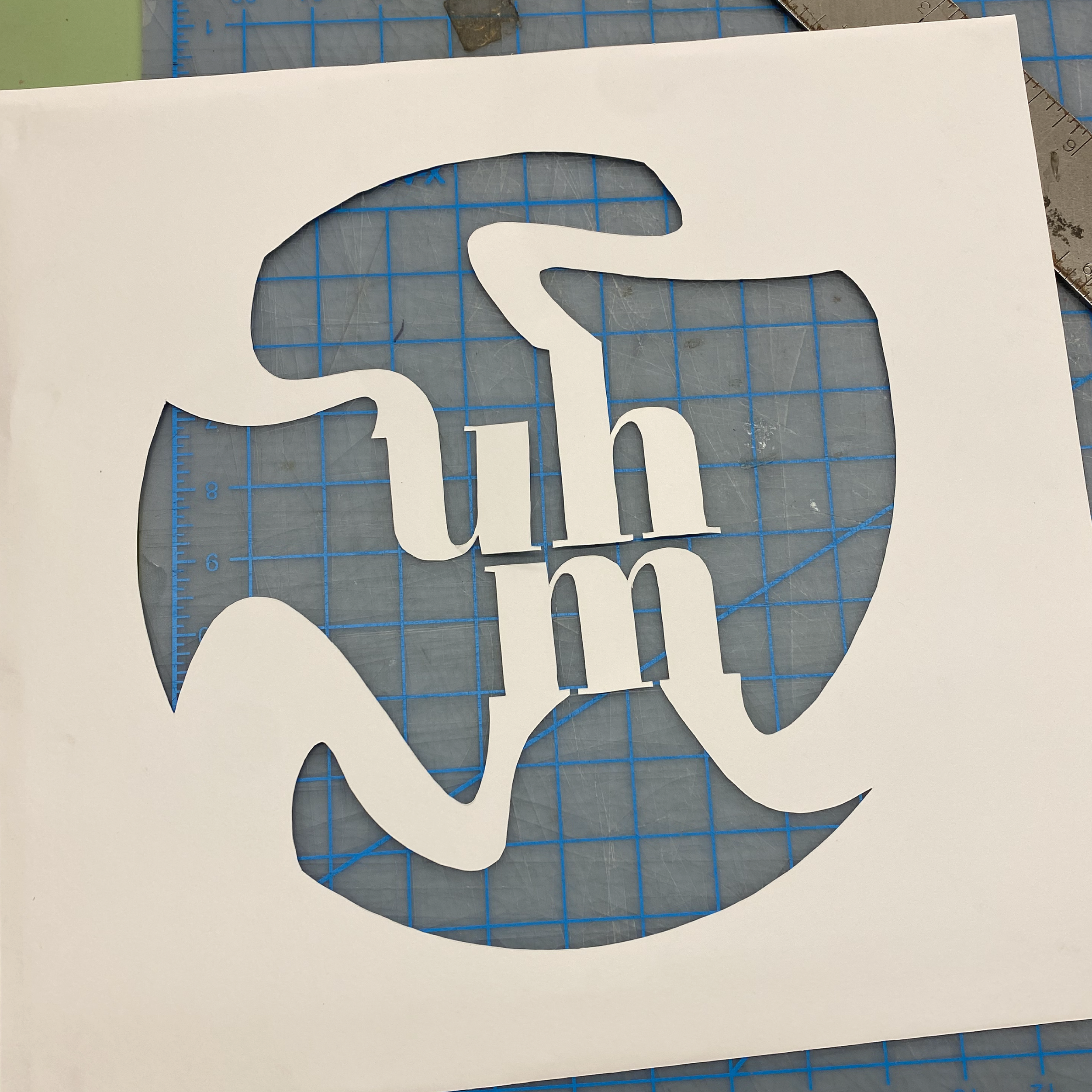
Process: The candy I received was some chocolate covered balls with a cookie wafer centre. In eating these, the sensation of the air pockets throughout the cookie contrast the milky smooth chocolate. My build represents that by a smooth and oozing cover with dynamic pockets on the inside that play with light and create shadows in a fun way!
Candy Box
Experiential Design
Objective: In a lottery choice of un-marked candy, snack or beverage, explore the sensory experience and express it in spray paint and paper cutting, while including a 3-letter word in suitable typography.


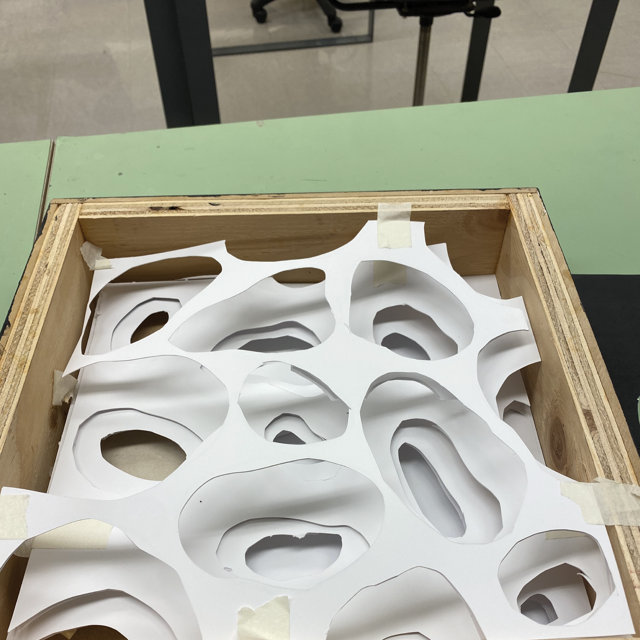


Extra Ordinary
Experiential Design
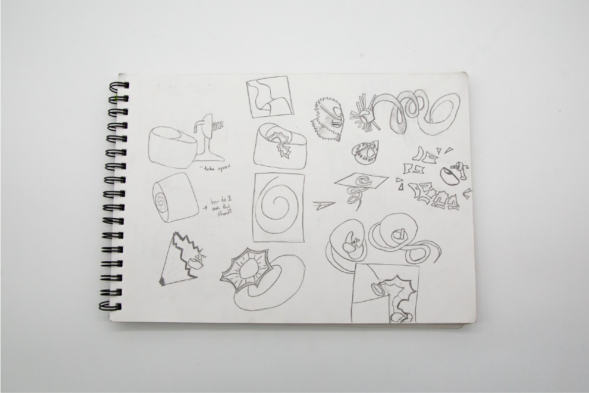
Objective: From a lottery selection of random objects, identify, research and then design an engaging presentation that expresses the experience of an object in only white paper.
Process: After opening a pencil sharpener, I began to ideate with scale and how I could make this nostalgic tool appear extraordinary in a new way. Making prototypes to create the write pencil shavings took some time but after some iterations I was able to find a model that played with the light in a fun way!