Vivid | Perceptive | Open
I explore new ways to collaboratively create vibrant and meaningful designs.
Graphic Designer

Ora
Graphic Design | Branding | Packaging
Objective: Design a brand identity, graphic standards and applications by completing a self-initiated design project to meet professional development goals.
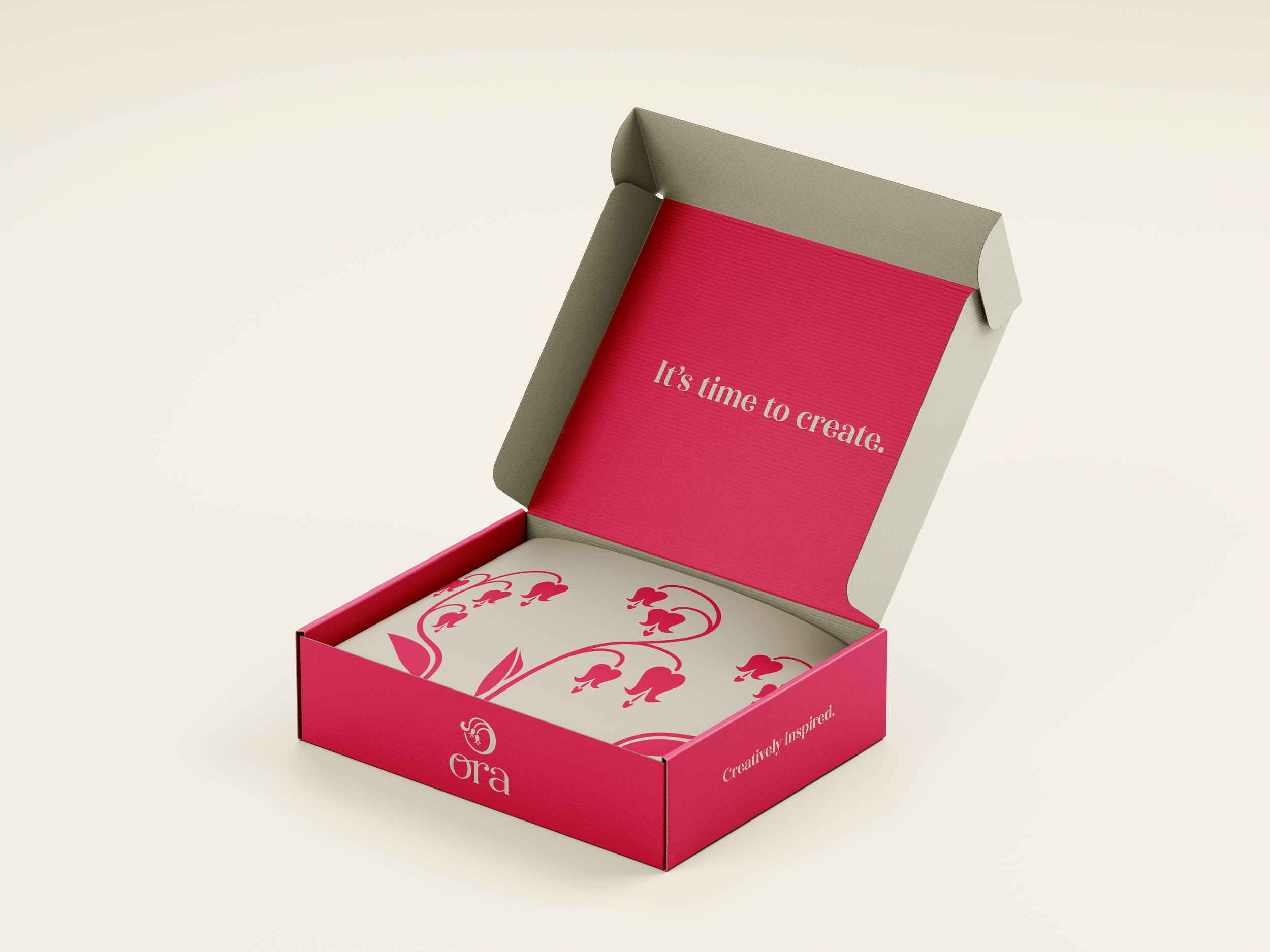
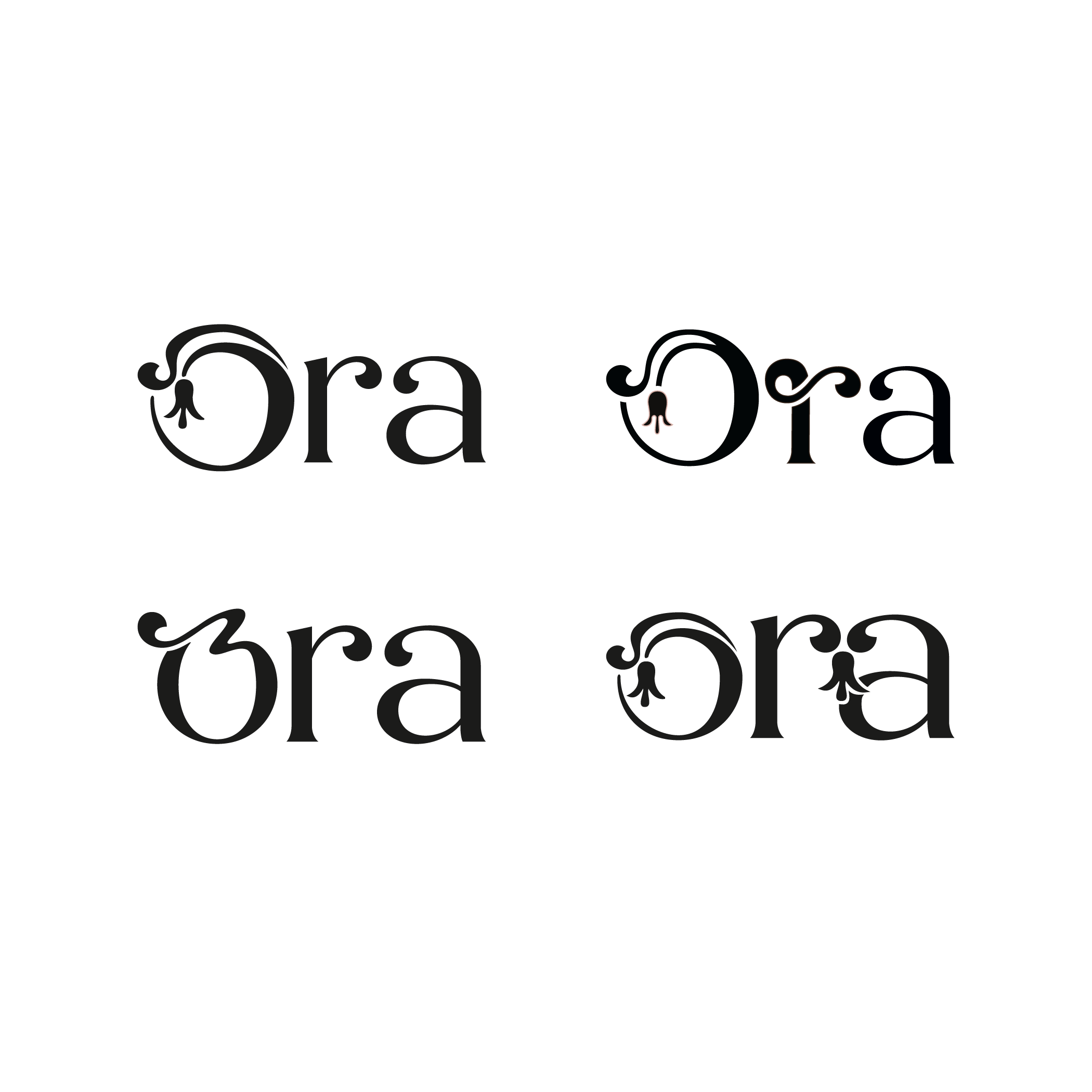
For this project, I wanted to combine my love for traditional art with digital design. I created Ora, a conceptual brand, focused on making high-quality, plant-based paints and art supplies.
The name Ora was derived from Flora and Aura to create a name that represents the brand's commitment to the environment and artistic expression.
I took inspiration from Art Nouveau illustrations and combined them with solid colours. When buying pigments, it’s important to see the colour represented on the packaging. This is why I chose to make a bold logo that could adapt to the colour of any background. The packaging features different flowers to differentiate product lines.


-
![]()
Oil Pastels Box Set
-
![]()
Shipping Box
-
![]()
Reusable Bag
-
![]()
Oil Paint Tubes
-
![]()
Sketches
-
![]()
Logo Digital Iterations
-
![]()
Symbol Digital Iterations
-
![]()
Branding Iterations
-
![]()
-
![]()
-
![]()


Rethink Recycling
Graphic Design | Branding | Marketing
Objective: Design a marketing communications campaign to inform, promote awareness and inspire action for a social problem in a multicultural society.
Rethink Recycling is a project focused on making recycling easier, more accessible and more fun. In a group of 3, we worked on posters, a website and app, an infographic and brochure, and conceptualizing a launch event.

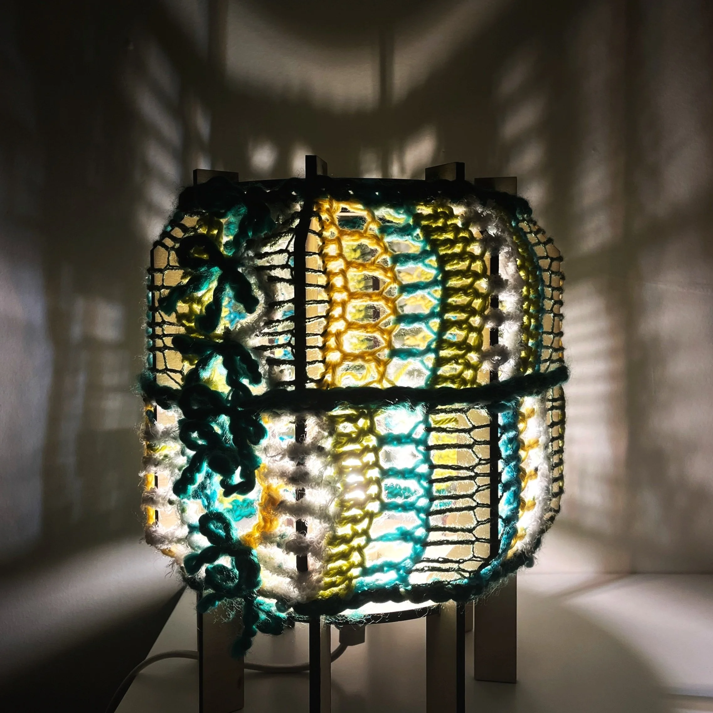
Crochet Lamp
Fabrication | Materiality & Sustainability
Objective: Design, Document, and Fabricate a small Luminous Object, while exploring the relationship between Narrative, Form, Materiality, and Value— from concept to fabrication.
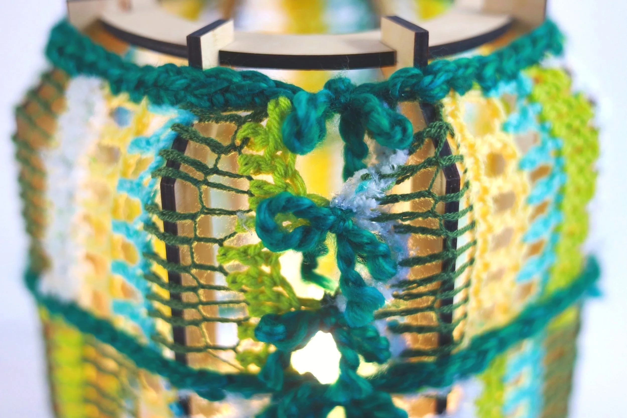
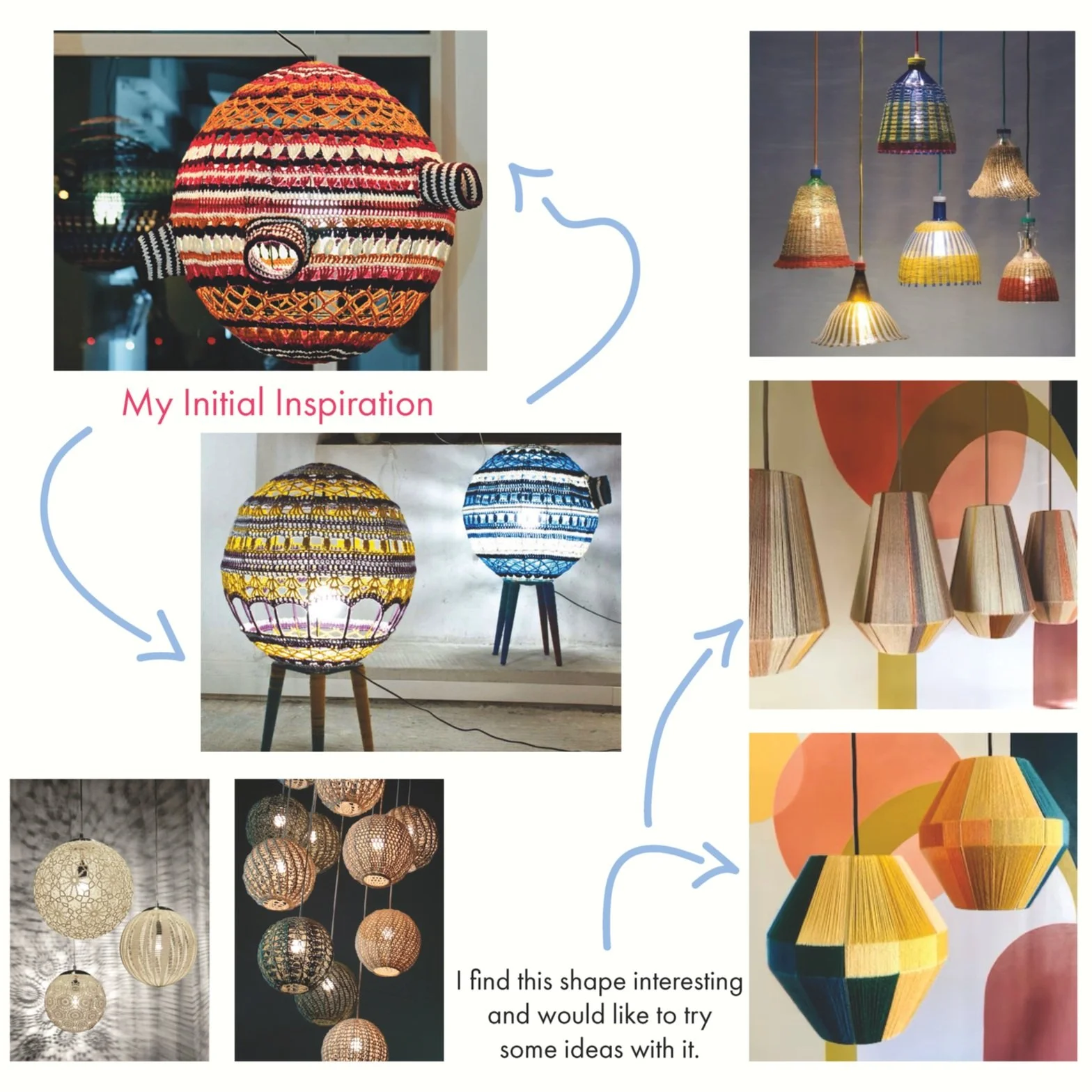
The inspiration for my luminous object, the Crochet Lamp, came from the unravelling of a previous project.
I crochet without patterns because I enjoy the process of figuring out how something is constructed as I go. However, this means projects don’t always turn out. I had yarn I wanted to recycle and saw an opportunity to crochet a lampshade. The crochet lampshade releases a lot of light and casts beautiful shadows to create a warm and playful atmosphere.
I designed the lamp to be versatile and adaptable. Influenced by lanterns and spheres, the lamp's frame is wide and open. I kept the shape of the lamp simplistic to give freedom to what the crochet lampshade can be. The lampshade can be removed and replaced with an entirely new crochet piece. There are no limits to what the crochet lampshade can be, making this a project that can be revisited at any time.
-
![]()
Inspiration
-
![]()
Sketches
-
![]()
Orthographic Drawings
-
![]()
-
![]()
Cardboard Mockup
-
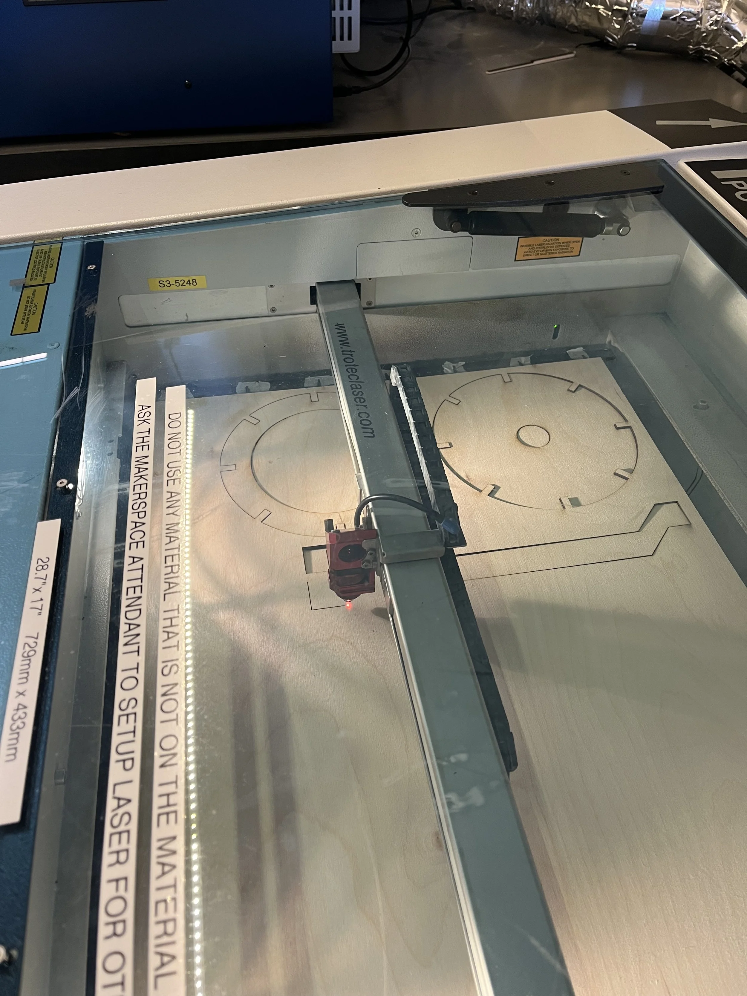
![]()
Laser Cutting
-
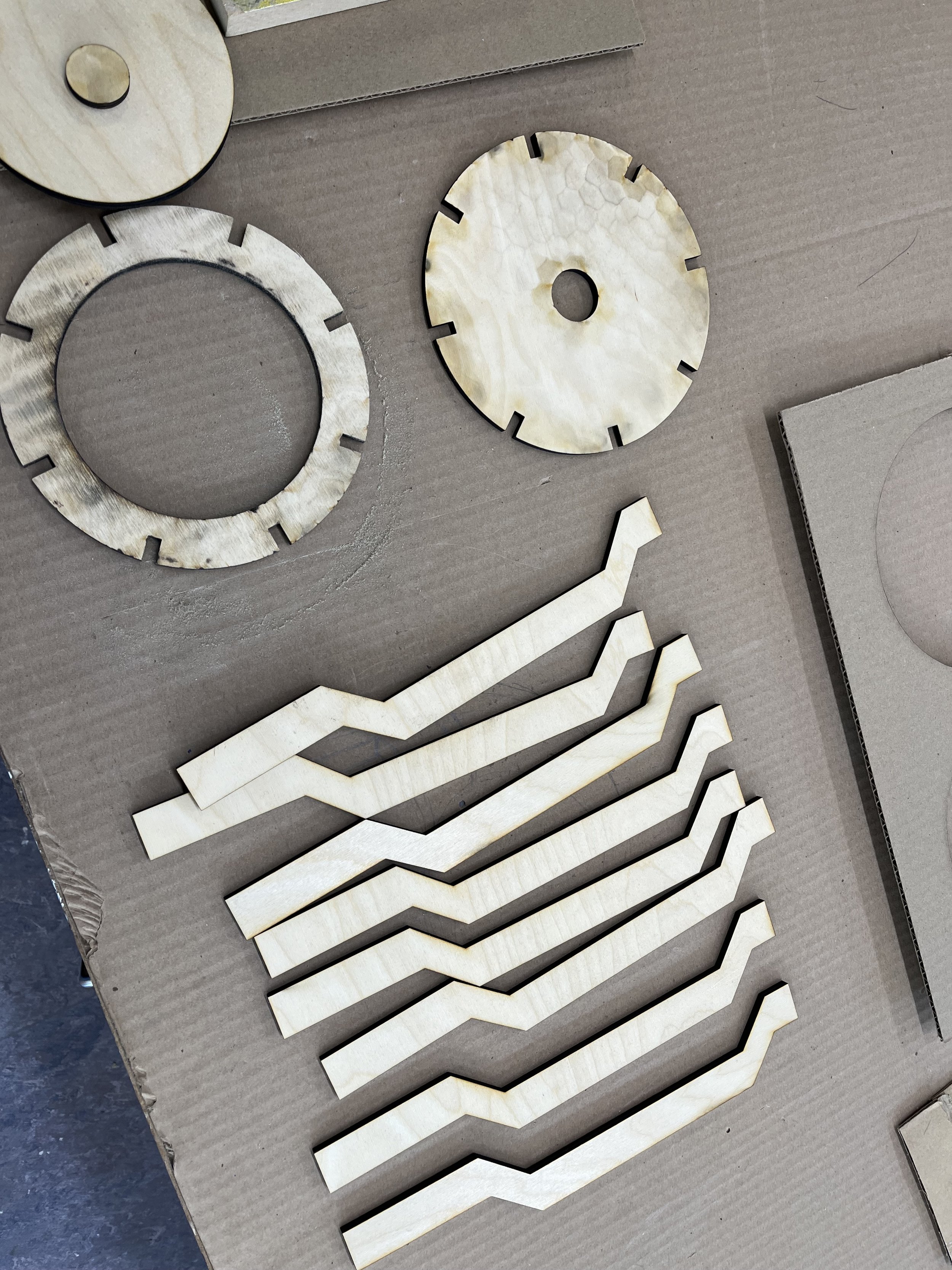
![]()
Cut Pieces
-
![]()
Final Product


Wack Pasta Co.
Graphic Design | Branding | Packaging
Objective: Design a brand and packaging to introduce a new line of locally produced organic products, targeted at a young and urban audience.

For this project, I wanted to make a pasta brand that would stand out on the shelves. I worked with simplistic shapes and strong colours to emphasize the brand’s name, Wack Pasta Co.


Martha Graham Magazine
Typography | Printing | Editorial
Objective: Design a 4-page magazine considering how text and design conveys meaning; employing text hierarchies as a way to navigate; selecting appropriate typeface pairings; creating effective image and text combinations; and creating visual continuity from page to page.

Inspired by the fundamental concepts of modern dance and the Graham technique, I explored how to represent contraction and release throughout this magazine spread.


Extra Ordinary
Experiential | Paper Cutting
Objective: From a lottery selection of random objects, identify, research and then design an engaging presentation that expresses the experience of an object in only white paper.
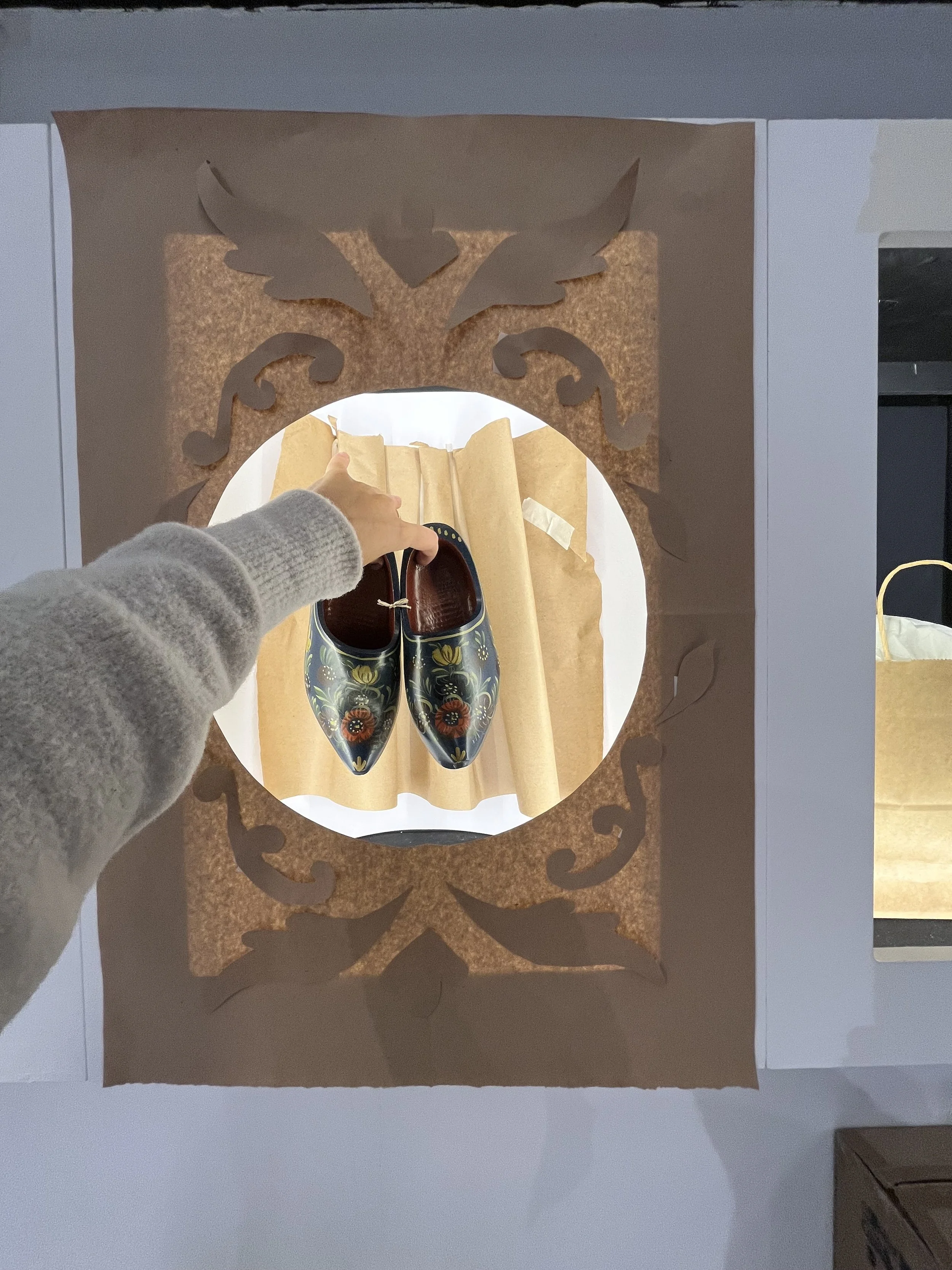
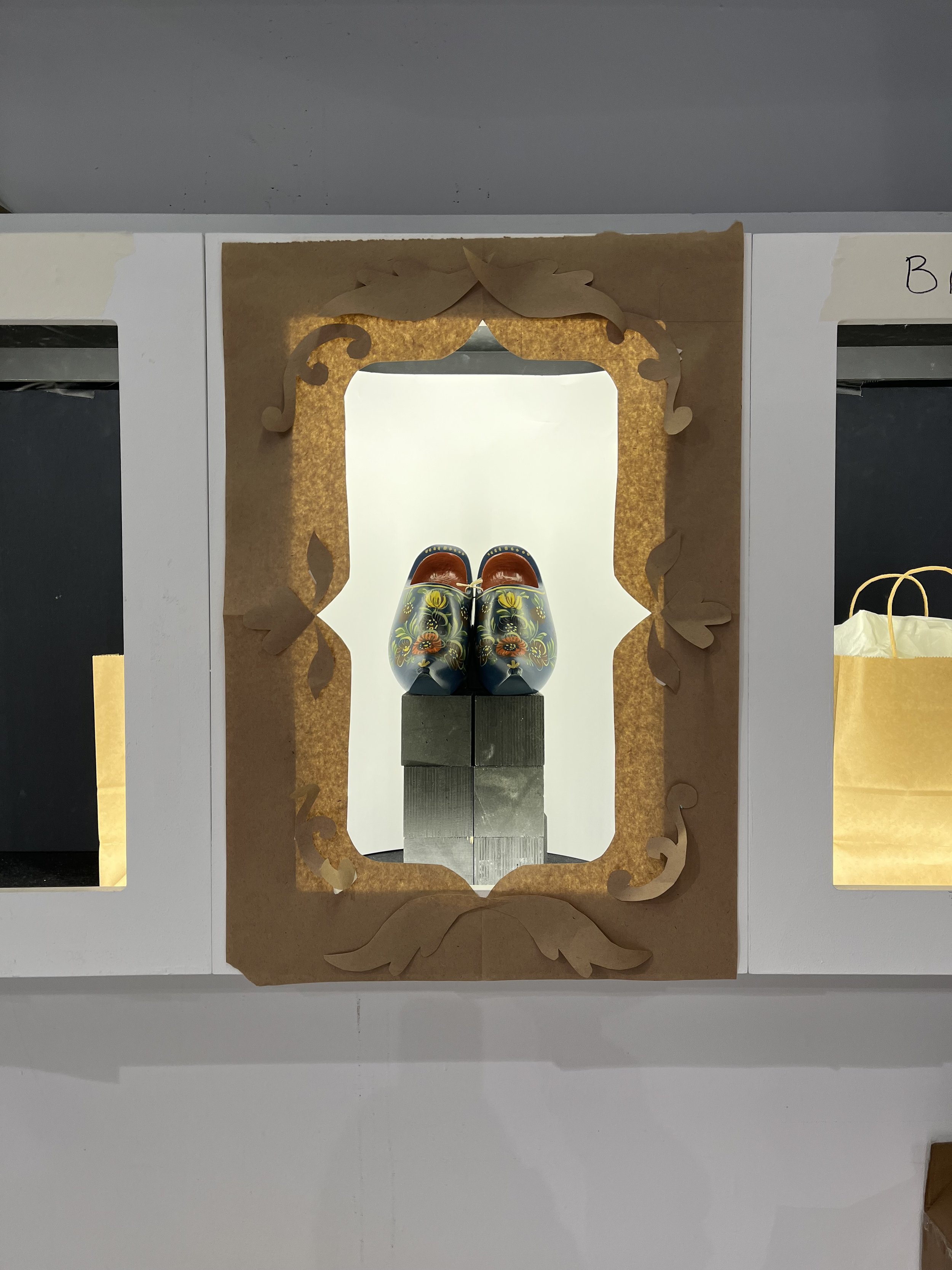
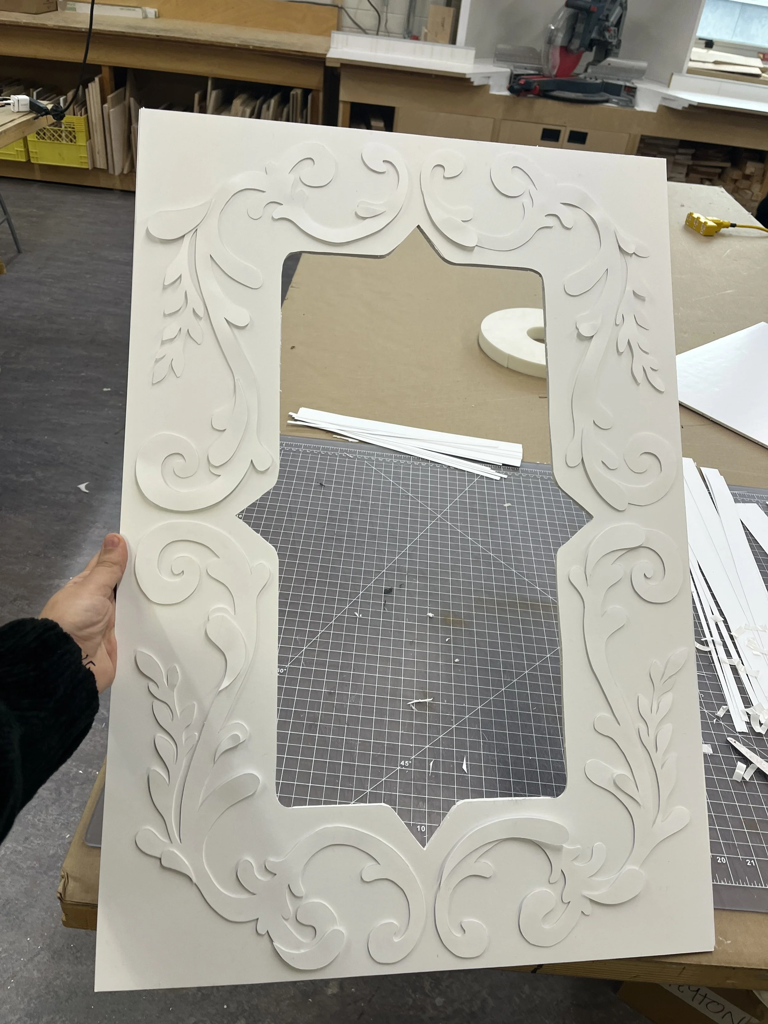
For the Extra Ordinary project, I chose a pair of clogs at random.
I researched the clogs and the city they were from. I learned they were from Hindeloopen, a small fishing village in the Netherlands.
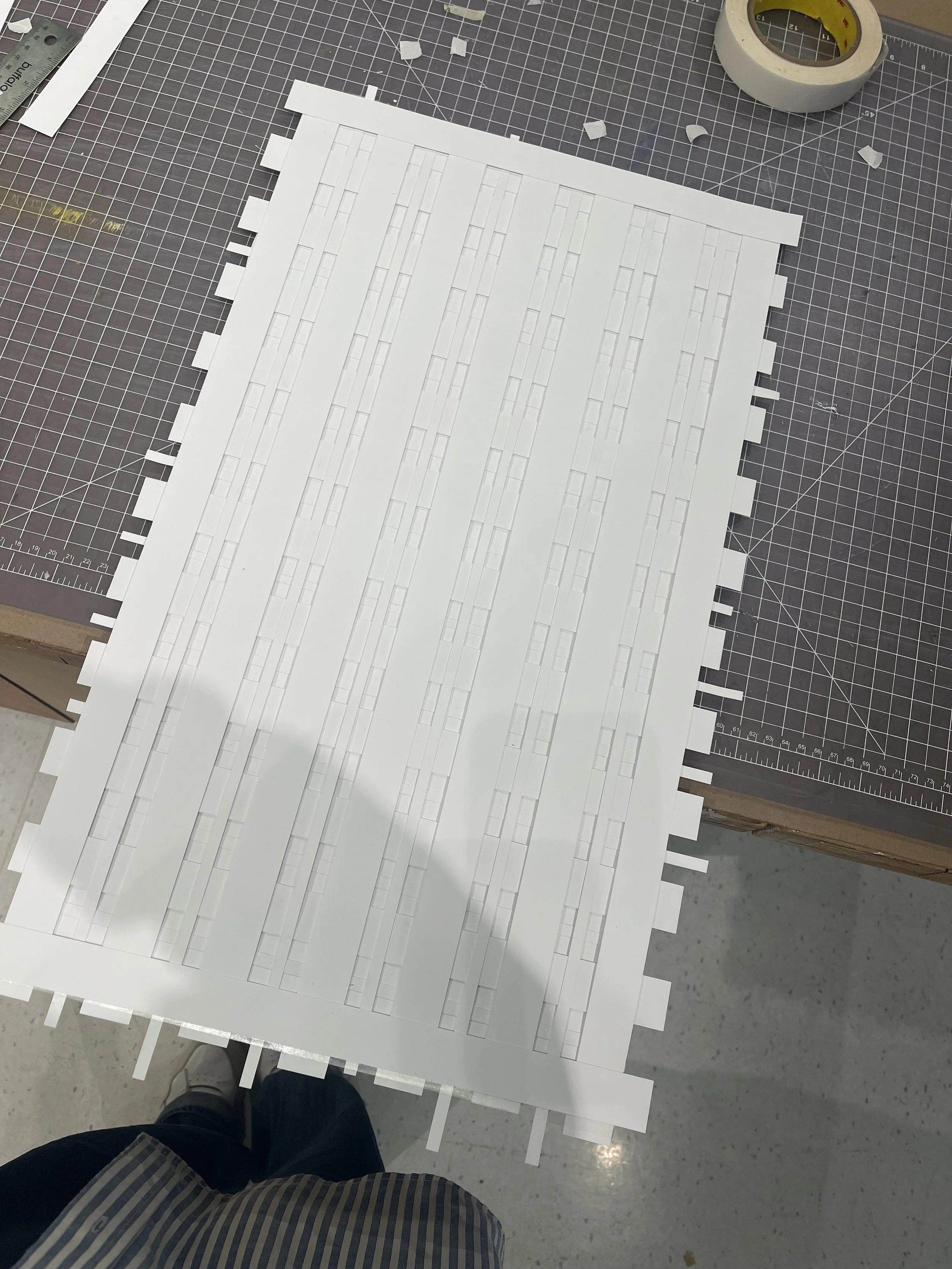
The Hindeloopen art style is fluid and balanced. It uses light paint strokes to create florals, birds and boats. Influenced by traditional Hindeloopen costume, I contrasted the delicate exterior frame with a structured, plaid pattern.
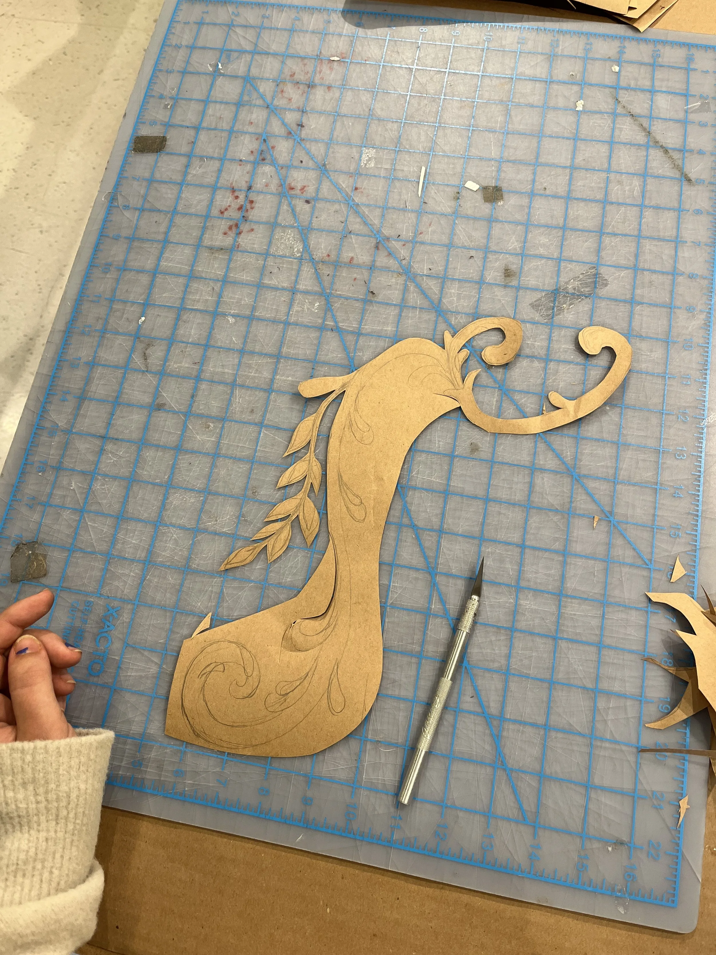
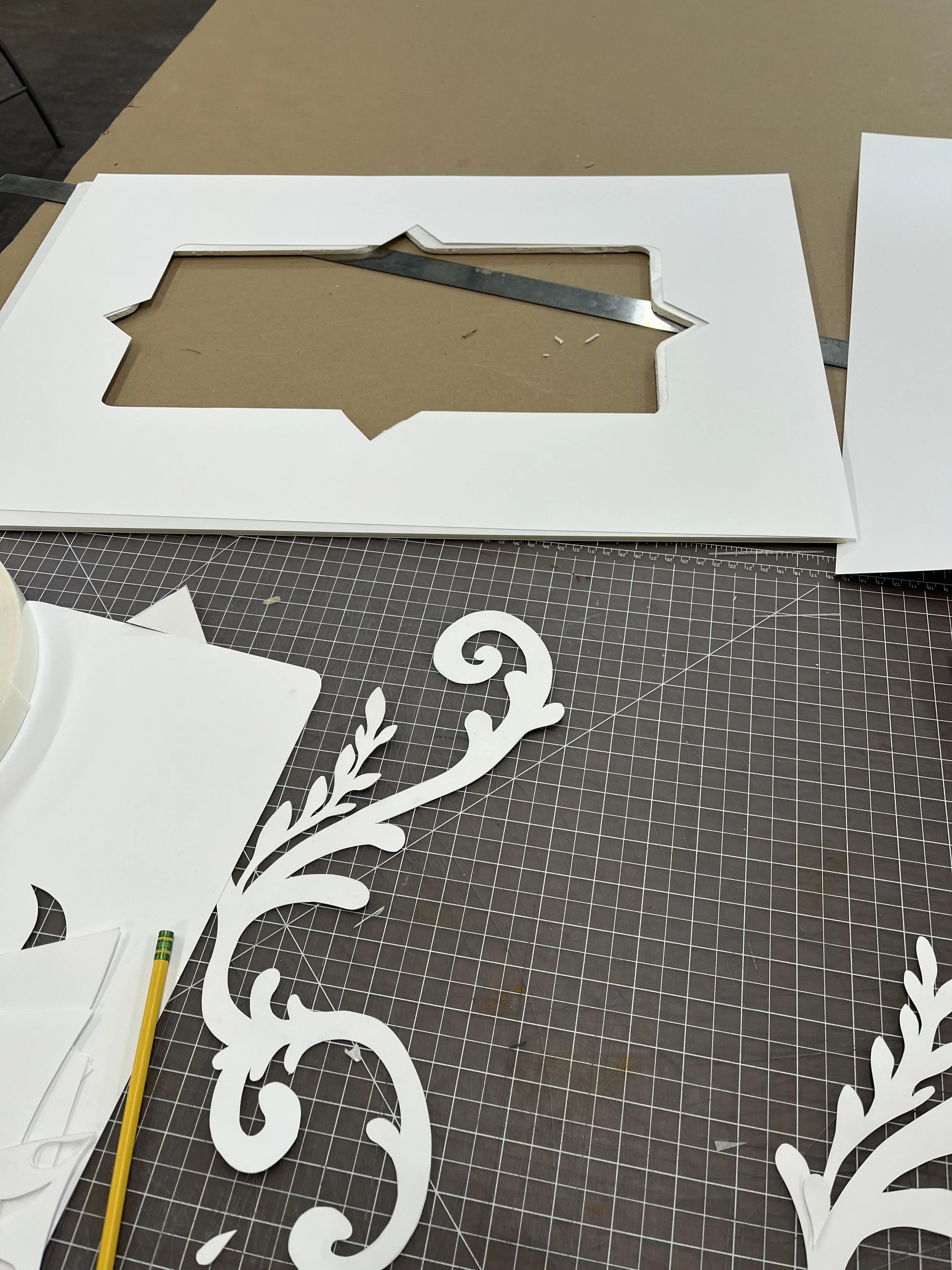
I used foamcore lined with paper to build the showcase’s frame. The shape of the clogs toe led me to create the frame’s shape. I drew a stencil to trace the floral pattern before cutting each piece by hand. I used foamcore to raise strips of the plaid to add dimension.
I feel I was able to represent the bright and colourful background of the clogs despite the challenging limitation of white paper.
-
![]()
Paper Mockup 1
-
![]()
Paper Mockup 2
-
![]()
Creating Stencils
-
![]()
Paper Cutting
-
![]()
Back Panel
-
![]()
Facade