
Nostalgic| Dreamy | Uncommon
As an artistic designer, I approach solutions with a unique perspective bringing objects and environments alike to life.
Multidisciplinary Designer


Heavenly Turmoil
Band Brand Identity | Branding | Packaging
Objective: Design a brand identity, graphic standards and applications by completing a self-initiated design project to meet professional development goals.
Heavenly Turmoil is based on a fictional band. I was drawn to the idea of an oxymoron. Music typically associated as “dark” has always brought me great comfort so the name “Heavenly Turmoil” clicked well to me. The band is created through the lens of a record label advertising its bands. I created different versions of products for the band. This was an idea I had for a while so creating the branding for it was exciting. It was based on a lot of other similar post-hardcore or metal bands I enjoy. All the images were photographs I had taken. The band is targeted as being for and by the alternative community and creating music that is explosive, dark, and mesmerizing.
Luminous Object- Windchime
Lighting Design| Industrial Design | Fabrication
Objective: Design, Document, and Fabricate a small Luminous Object, while exploring the relationship between Narrative, Form, Materiality, and Value— from concept to fabrication.


My narrative for this project was based on a windchime. In the design I wanted to focus on movement and repetition. My goal was to create an object that feels like a stationary windchime.
I began by doing research on different forms of windchimes and came across wooden ones and settled the form on something similar. Something I really love about the design is it actually makes noise when it moves. I also took careful time on the knots at the top using glue.
The base was created with laser cutting and then slats of wood of varying heights were slotted in. At the top, smalls holes were drilled and twine is utilized to hang other slats of wood creating the entire structure.
Process
〰️
Process 〰️


Candy Box
Project Tags | Design | Branding
Objective: In a lottery choice of un-marked candy, snack or beverage, explore the sensory experience and express it in spray paint and paper cutting, while including a 3-letter word in suitable typography.
In the candy box project, I received a specific type of bubble gum. It immediately felt nostalgic and I was drawn to both bright and pastel colors. I based the shapes loosely around the form the packaging. I also repeated the circle narrative of blowing bubbles with bubble gum. The highlights on the candy were to play into a cartoon like and nostalgic feeling driven by the emotions of the product.

Process
〰️
Process 〰️


Brochure
Project Tags | Design | Branding
Objective: Design and layout a brochure that features one of five historically significant typefaces. One side of the brochure highlights historical content while the other side was a poster. The key is for the brochure to express the character and personality of the typeface in addition to the basic information.
In the brochure project, we were to pick a historical font and I chose Clarendon. Through doing research on the Clarendon font, I found it was commonly used for wanted poster in the west. From there, I went for a more bold narrative leaning heavily into a theme of the starburst as it represented the boldness I wanted to picture. The colour palette was chosen because it contrasted well with the typical imagery of the Clarendon font.


Extra Ordinary Exhibit
Band Brand Identity | Branding | Packaging
Objective: From a lottery selection of random objects, identify, research and then design an engaging presentation that expresses the experience of an object in only white paper.
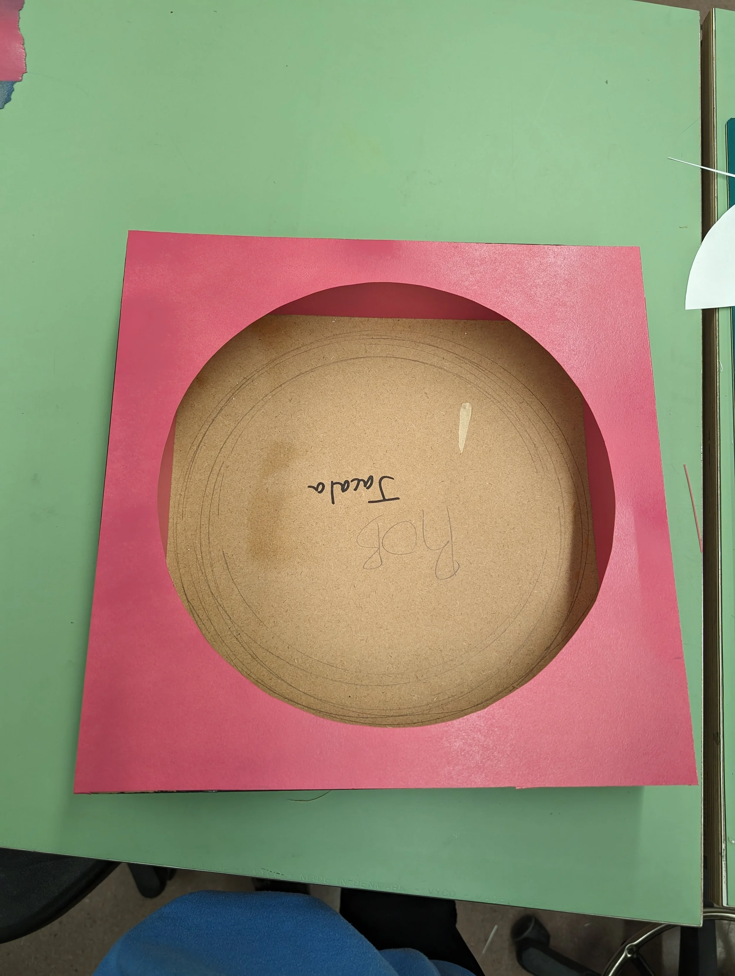
For this exhibit, I had a lot of fun delving into Jascha Heifetz, the artist of this record. He was an iconic violinist and through listening to his work, I chose the form of the music notes to illustrate how his music flows, effortlessly like water. The choice to place the work on a pedestal came from a quote that stood out to me in my research. “If you provoke a jealous God by playing with such superhuman perfection, you will die young. I earnestly advise you to play something badly every night before going to bed, instead of saying your prayers. No mortal should presume to play so faultlessly.” -Georg Bernard Shaw. He was speaking about Jascha Heifetz and I immediately decided someone spoken spoken about in this way must be put on a pedestal. I wish it showed a bit more in the final design but I overall believe I communicated my concept of how much his music was revered.


Process
〰️
Process 〰️


Parklet 1.0
Band Brand Identity | Branding | Packaging
Objective: Design a small Architectural Public Space: a Parklet. Review, apply, and strengthen skills with 3D modelling and 2D drawing tools, both in the design development and communication processes, while exploring design principles and spatial awareness concepts.
My concept for the parklet surrounded the idea of a space in the city where you can have a piece of nature. The frame work was based around a greenhouse and allows for the hanging of many plants. The large bench encourages people to connect with each other in a larger way. The smaller table allows for an opportunity of eating, working, or separation in smaller groups if desired.


Connect with me!