
Logical | Integral | Flexible
Guiding you through each revolution with ingenuity and intention.
Multidisciplinary Designer
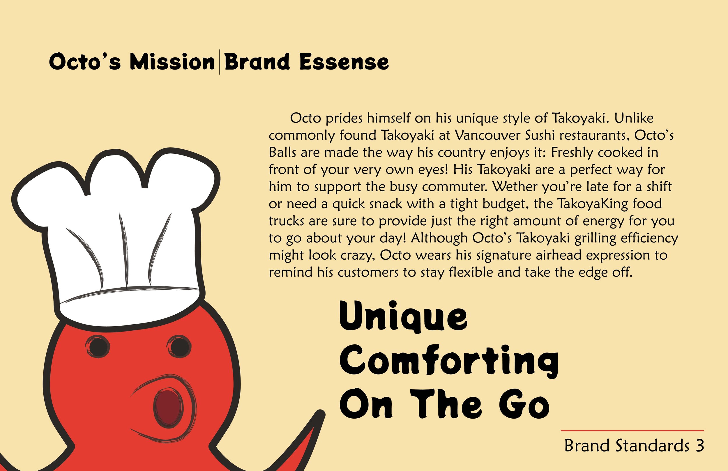
TakoyaKing Branding Project
Branding
Communication through persona.
Objective: Design a brand identity, graphic standards and applications by completing a self-initiated design project to meet professional development goals.
The current Takoyaki market in Vancouver tends to be overpriced and lackluster. Takoyaking set out to become the King of Vancouver Takoyaki. The challenge in this project centered around how to most effectively drive the mascot character “Octo the Octopus” to the forefront of the business’s identity.


Takoyaking Laneway House
Interiors and Architecture | Scale Modeling
Efficient yet comfortable form.
Objective: Design a laneway house that reimagines the potential of Vancouver’s urban fabric by integrating nonresidential programs to create dynamic, mixed-use corridors. Explore how these often-overlooked spaces can evolve into vibrant community hubs, balancing residential living with broader neighborhood engagement.
If TakoyaKing became a physical store, what would it look like? Taking heavy inspiration from efficient Japanese form factor, I set out to expand the world of TakoyaKing. Because a restaurant program on the first floor is quite loud and claustrophobic, I created an open, one piece residential space for the second floor with plenty of breathing space. The conversion of the original SketchUp 3D model to a physical 3D printed output was a great learning opportunity.


Gundam Magazine Page
Scale Modeling | Typography | Print
Expression and balance through type and layout.
Objective: Design a 4-page magazine considering how text and design conveys meaning; employing text hierarchies as a way to navigate; selecting appropriate typeface pairings; creating effective image and text combinations; and creating visual continuity from page to page.
When I was assigned this project in my typography class, I thought it would be a great opportunity to showcase a plastic model kit that I previously built as a personal project. The biggest challenge of this project was to achieve visual balance between the photos included and the type body, as well as providing photos that encompassed the features of the product without overwhelming the viewer.


Extra Ordinary Project
Experiential | Fabrication
Emotive qualities expressed through shape.
Objective: Expanding on the concepts revealed in the research and development of the Extra Ordinary Project showcase, render a 20-foot square exhibition model that explores the experience of objects in a dimensional environment.
When I was assigned to work with this Phrenology bust, I didn’t even know what it stood for. Research of windy history and phony usages made me feel uneasy, so I decided to translate this feeling into a display for this bust. Inspired by historical phrenological instruments such as calipers, the spikes and caliper orbiters were very fun to make!


Mirrorscape Luminous Object
Fabrication | Material Applications
Simple is profound.
Objective: Design, Document, and Fabricate a small Luminous Object, while exploring the relationship between Narrative, Form, Materiality, and Value— from concept to fabrication.
The Mirrorscape aims to show that objects with simple form can have many dimensions of depth. I came across an image of a laser diffusing and lighting an entire piece of plexiglass and saw an opportunity. Combined with the refractive surface of plexiglass, I came up with a concept to provide a modular “hologram” landscape display.


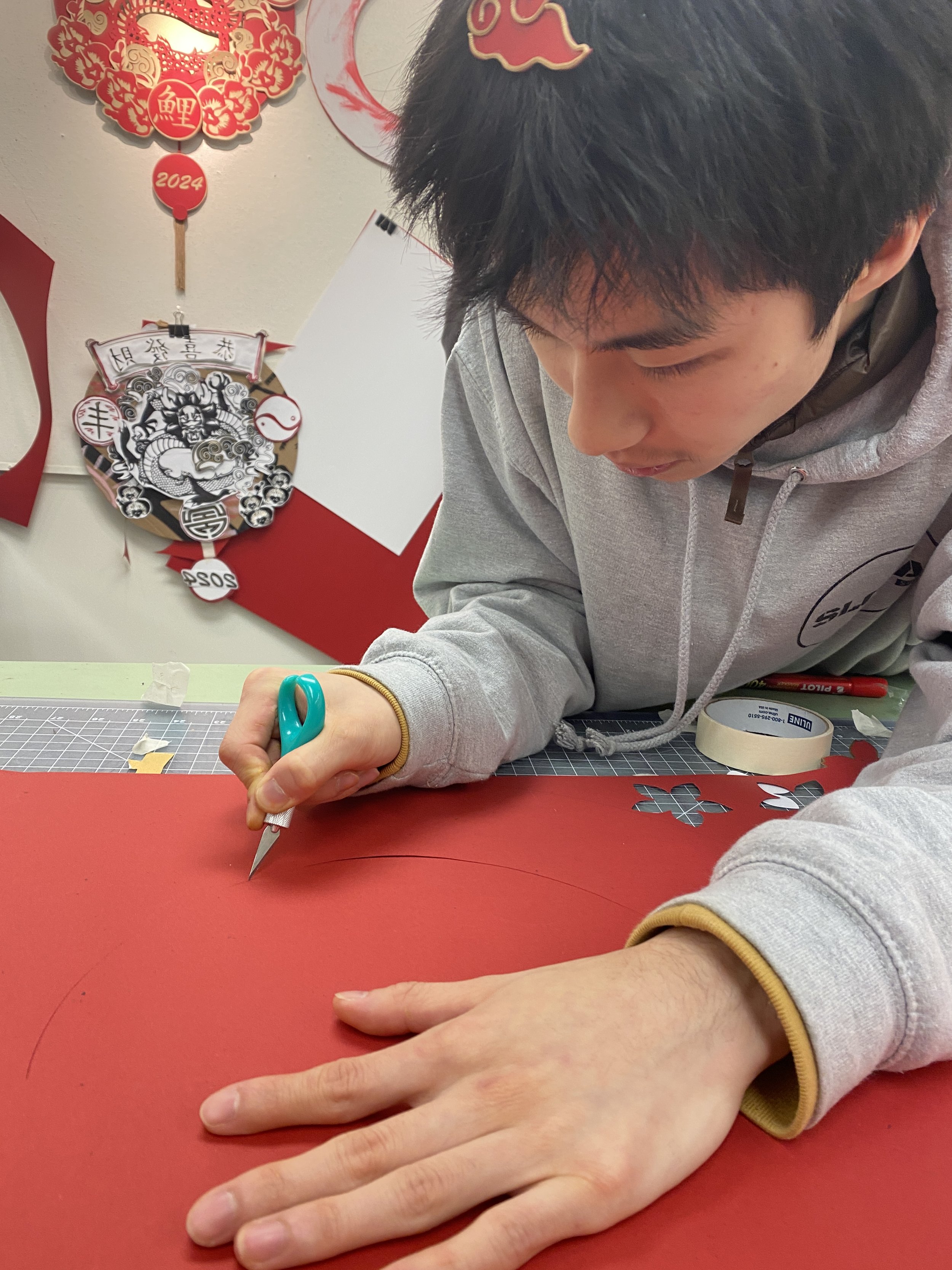
New Years 2024 Wreath
Experiential | Fabrication
Problem solving through research.
Objective: Researching the multitude of meanings held within the visual cliches and motifs of Lunar New Year, handcraft a wreath executed in traditional Asian papercutting techniques.
I went through multiple concepts and iterations attempting to combine symbols cohesively to narrate a direction, and the end result was the visual motif consisting of clouds, a dragon and bamboo. These auspicious symbols represent luck, strength, and growth, and to a happy new year!


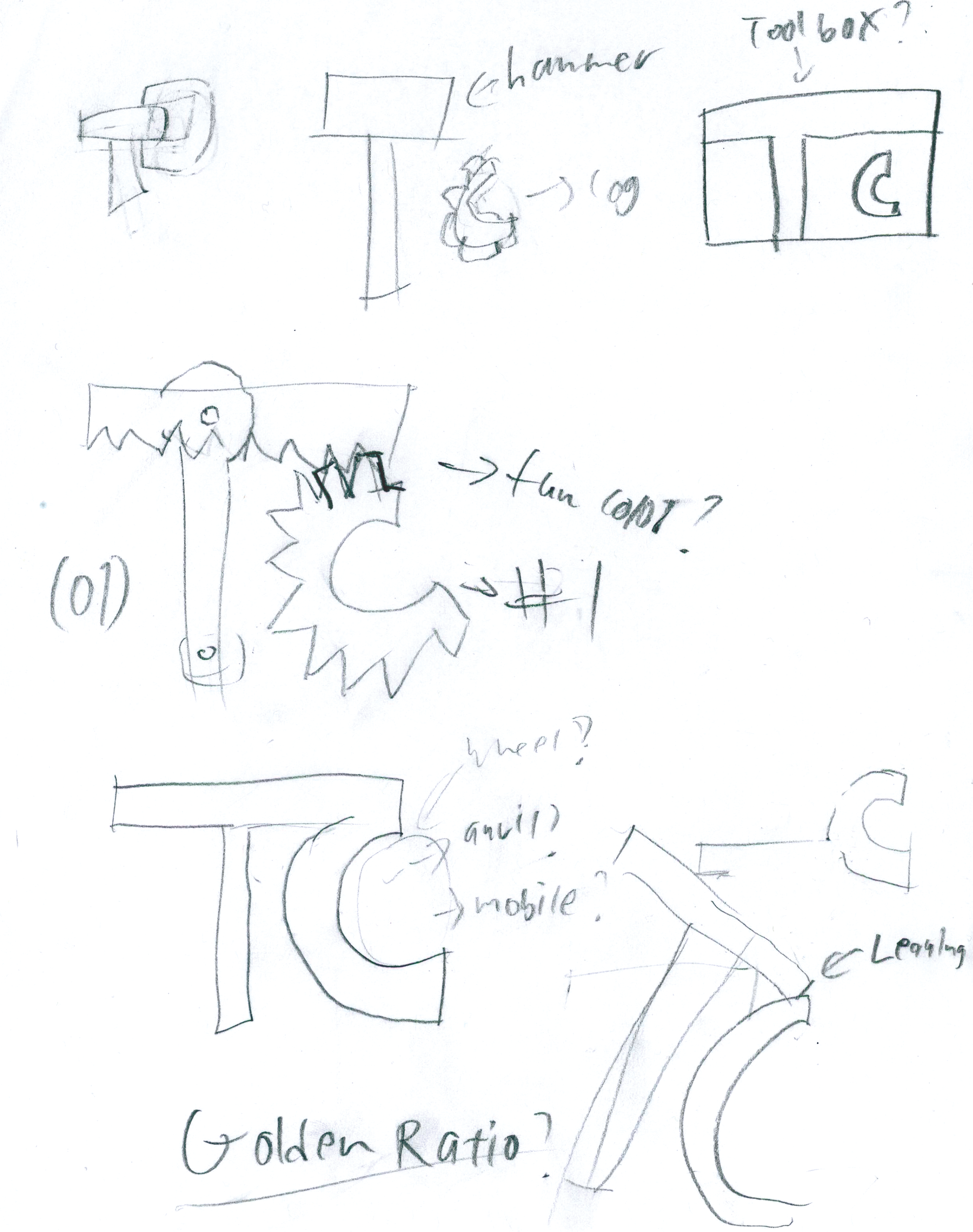
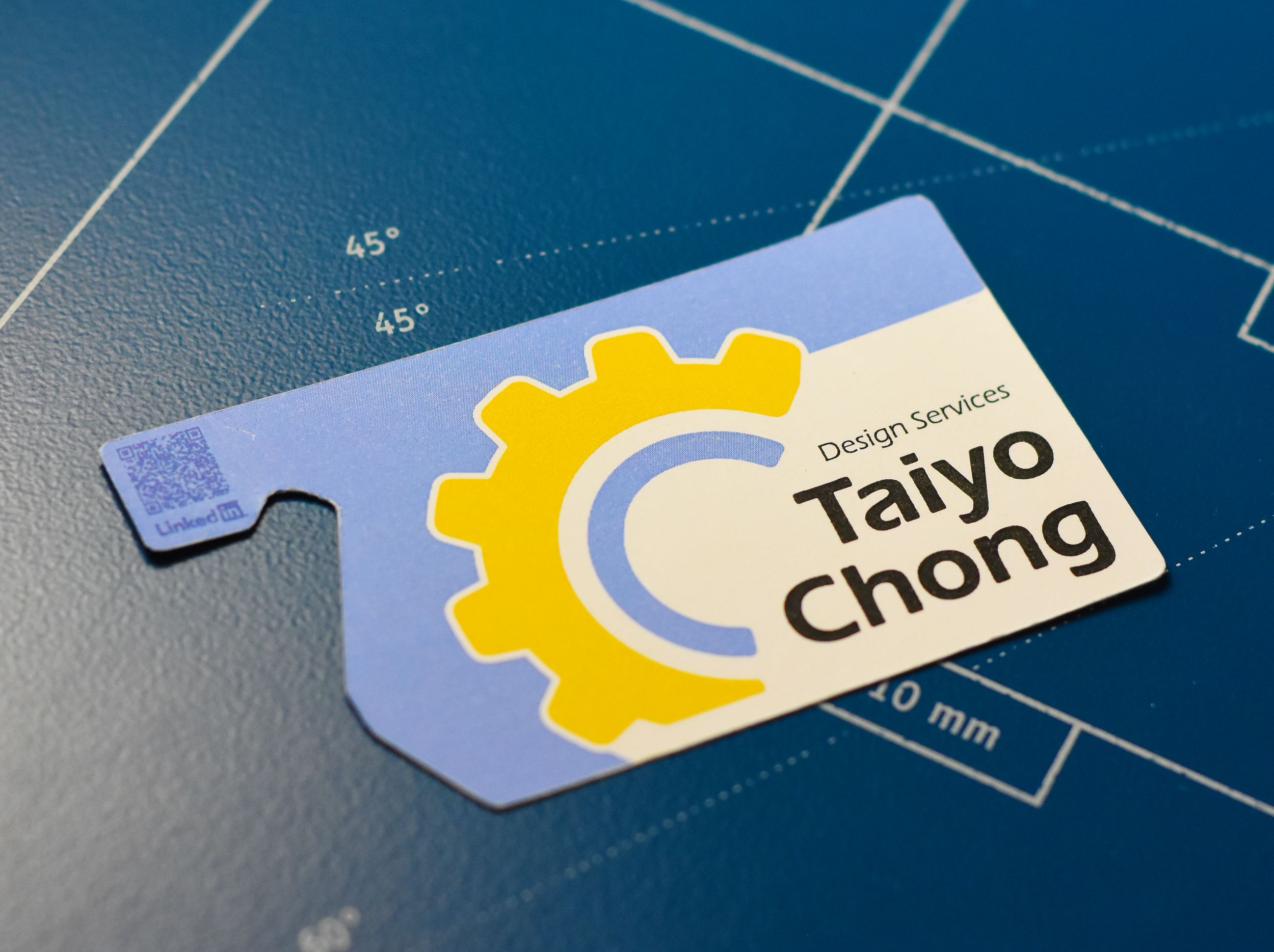
Personal Branding Project
Branding
“Guiding you through each revolution with ingenuity and intention”
Objective: Through a close look into the objectives after the program is finished and with the type of design career preferred, define the core concepts and messages needed to communicate a design for a professional visual identity.
As I am aiming to specialize in Industrial Design, I looked for an Icon that could communicate creativity and mechanical proficiency while still staying warm and friendly. Throughout over 100 iterations, The solution to integrating both letters of my initials fluidly was to bend the “T” into the “C”.
Consistency throughout the icon, type, key words, and following who I am as a designer lead me to success.
Logical, Integral, Flexible.


Let’s Chat!
taiyocdesign@gmail.com
@Taiyo Chong
@taiyocdesign